AI-Powered automated dashboard
AI automated dashboards are advanced tools that use artificial intelligence to simplify and enhance data visualization and insight generation. These AI-powered dashboards are designed to streamline the process of converting raw data into actionable insights without the need for specialized skills. Here’s a breakdown of the key features and benefits:
Key Features:
- Automated Dashboard Creation:
- AI-Powered Engine: Lumenore’s smart analytics engine uses generative AI to automatically generate KPIs and dashboard layouts based on the user’s data.
- User-Friendly: Designed to help basic data analysts and business users understand their data without needing specialized dashboard developers.
- Personalization:
- Users can customize the dashboard by specifying their persona and preferred analysis.
- Automatically includes advanced analytics charts like Pareto, Correlation, Outlier, Top, and Bottom KPIs.
- Integration with Narrative Insights:
- Allows users to generate insights directly on the AI dashboards, completing the loop from data to insights.
- Saves time in decision-making processes by providing quick and comprehensive data analysis.
Benefits:
- Democratizes Analytics: Makes data analysis accessible to all users, regardless of technical expertise.
- Saves Time and Costs: Reduces the need for technical expertise and speeds up the insight generation process.
- Improves Visualization: Enhances data visualization through automatically generated, industry-standard KPIs and layouts.
- Reduces Specialist Reliance: Minimizes the need for dashboard developers, allowing business users to create and customize dashboards independently.
- Rapid Prototyping: Facilitates quick creation and iteration of dashboards, promoting faster data-driven decision-making.
Below are the steps to create an AI-powered Auto Dashboard:
Step 1: Open the URL, www.lumenore.com
Step 2: Sign in with your credentials or sign up to create a new account.
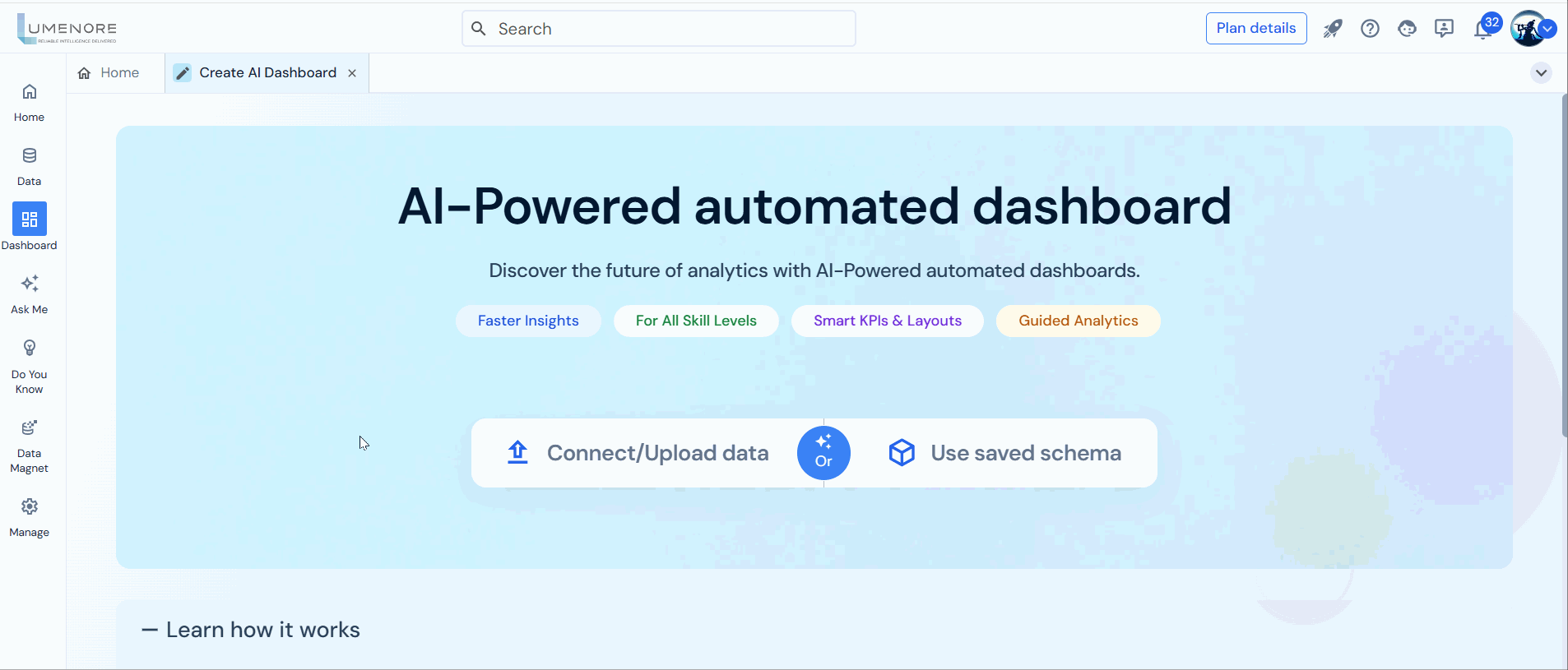
Step 3: After opening Lumenore, access “AI Automated Dashboard” either from the homepage or the Dashboard
From homepage:

From Dashboard:

Step 4: You’ve two options to begin with. First, you can connect or upload the dataset through different available connections. Second, you can utilize the previously saved schema.
1. On choosing “connect or upload data”:
Select the appropriate data connector to connect your dataset to the Lumenore dashboard.
Example 1:
- Choose the Excel connector if your data is stored in an Excel file.
- Afterwards, locate on your computer to upload the data file. Additionally, you have the option to utilize cloud storage, establish new connections, and import data.
- After the import process finishes, you can view the name of the imported file here. Now, click “Next” to proceed.
Example 2:
- Let’s select the Microsoft SQL server as a connector.
- Click on “Create new connection.
- The user is required to input the following information:
- Host
- Port
- Database
- User
- Password
- After entering this data, click on the “Test Connection” button. A pop-up will confirm that the connection details are valid.
- You can choose to either save the connection or use it without saving.

2. On choosing saved schema:

Note: Before proceeding, ensure that your dataset is cleaned and formatted into a single table with appropriate column names and table structure.
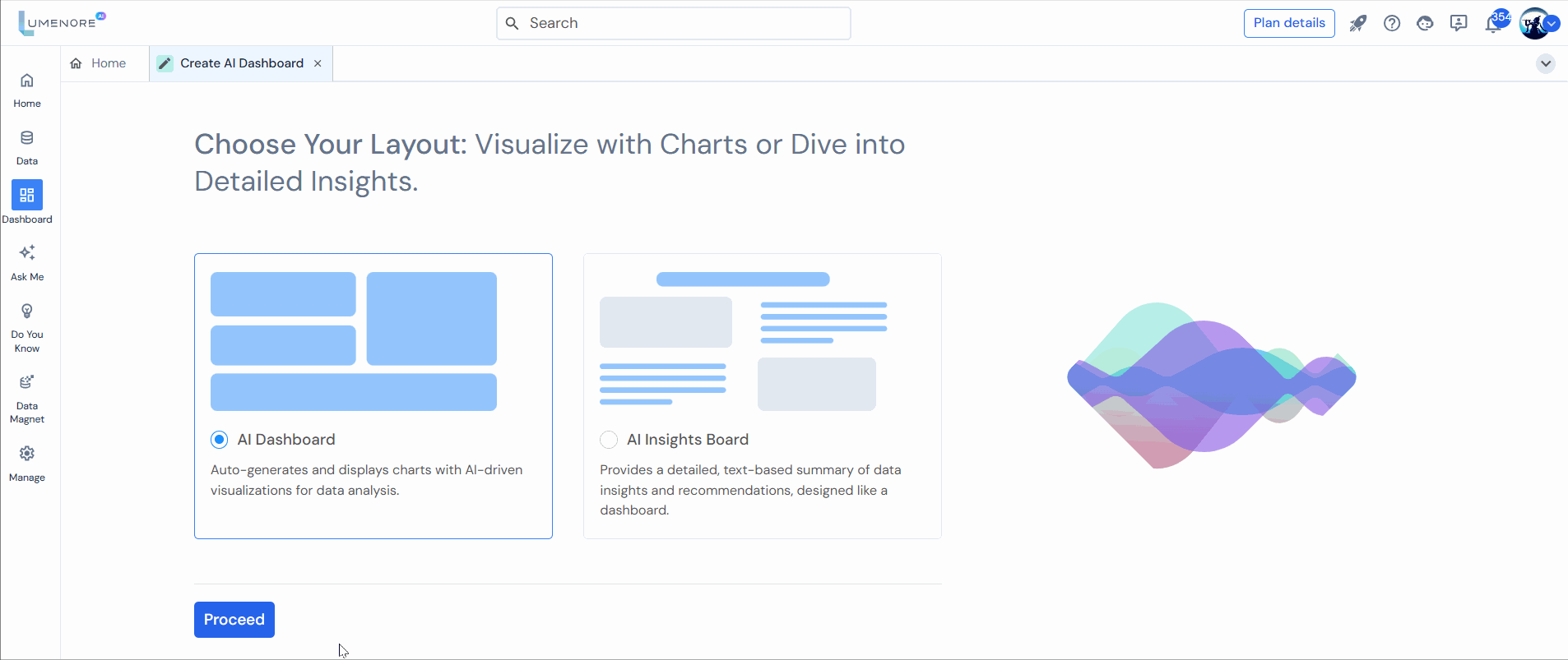
Step 5: Select a single table from your dataset as our system is designed to support single-table dashboards. After making your selection, click “Proceed.“
Step 6: Customize your dashboard to your specific needs by specifying your user persona and preferred analysis settings (user can skip).
Step 7: Provide the prompt for selecting derived measures that can be added to a dashboard for better analysis (optional).

Step 8: Let the Lumenore engine, fortified with AI solutions, function smoothly in the background.
- The progress bar indicates that the process of creating the dashboard is currently in progress, based on the user’s input.
- Did You Know section highlights the benefit of AI-powered automated dashboard creation, emphasizing that it can save around 70% of time and cost compared to manual dashboard creation.
- Interactive Links provides an opportunity to explore more about the tool and its capabilities through an informative video.
Note: If creating a schema encounters an error, you’ll receive a notification and the option to retry. This process initiates with the data upload step again.
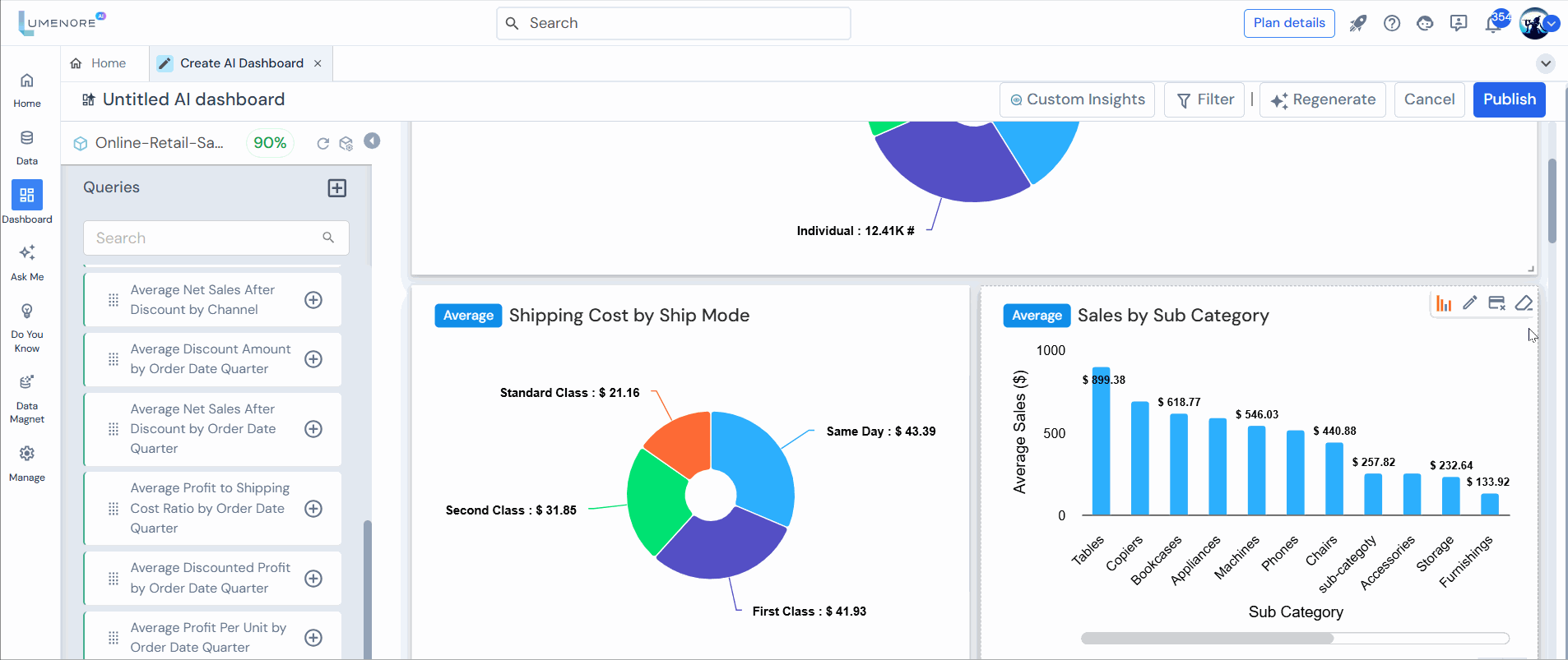
- The final step involves generating the Key Performance Indicators (KPIs) and dashboard.

Step 9:
- Upon successful generation, the Lumenore engine, powered by AI, automatically adds top KPIs, filters, and layout.
- Advanced analytics charts are available, valuable for decision-makers who need a deeper understanding of their data to inform strategic decisions, identify opportunities, and respond to challenges effectively.
- The advanced KPIs include Pareto, Correlation, Change, Trend, Outlier, Top, and Bottom analysis, etc.
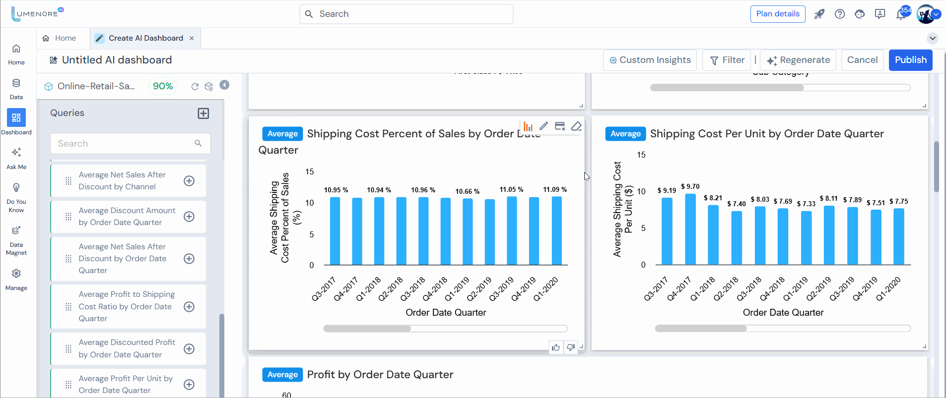
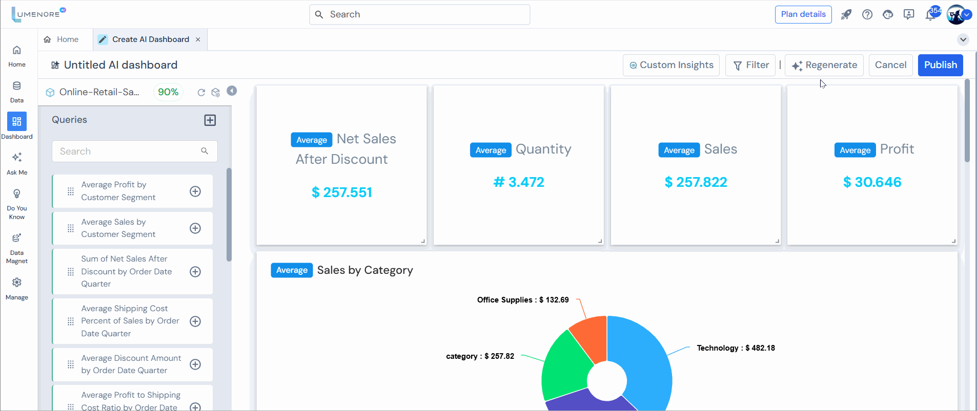
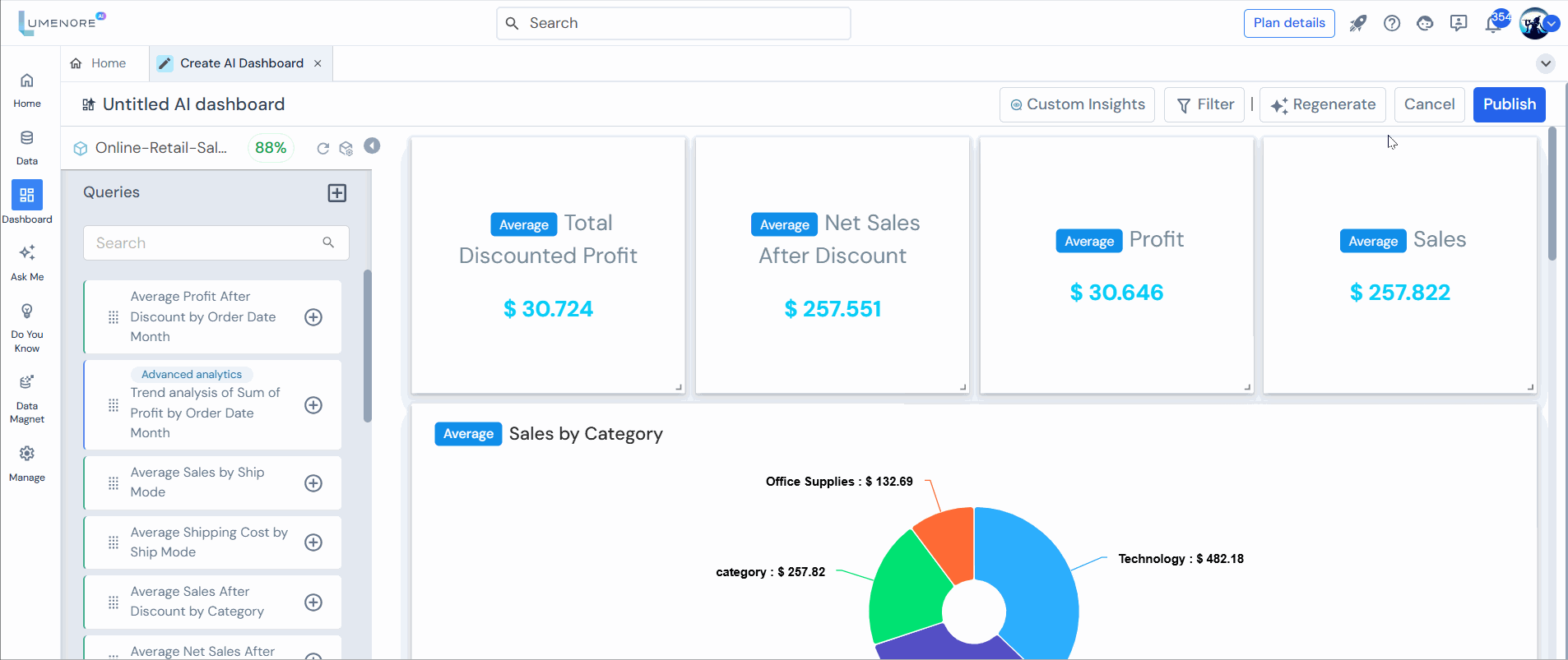
- Enhance your dashboard by dragging and dropping additional Key Performance Indicators (KPIs) from the left panel to replace existing KPIs, tailoring them to your business requirements.
- Add KPIs by clicking on the “+” icon, which will add a new card and KPI at the bottom of the dashboard.
Adjust the layout for a more refined appearance by moving around the Key Performance Indicators (KPIs).

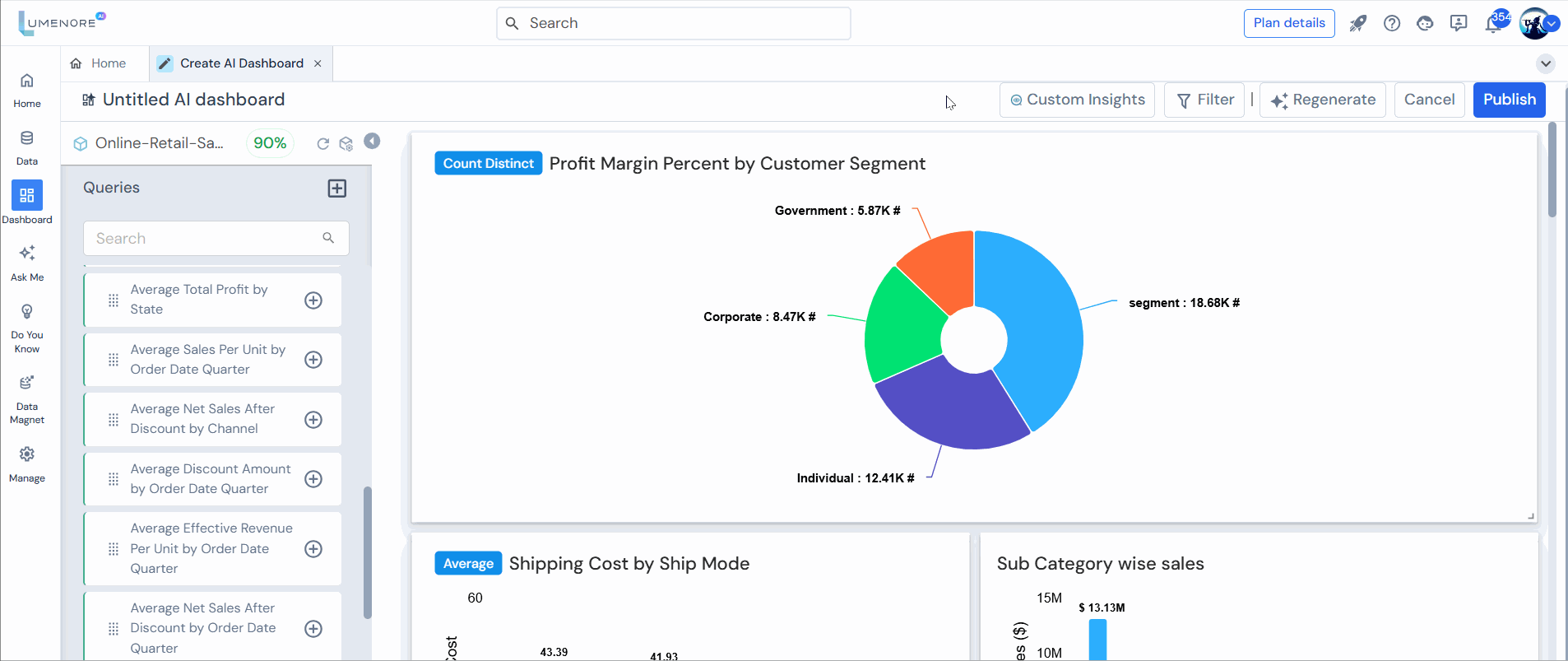
Feature for chart interaction
Aggregation Function
You can modify the aggregation function by clicking on the currently applied function. The available aggregation options include Sum (total value), Average (mean value), Minimum (lowest value), Maximum (highest value), Count (number of entries), and Count Distinct (number of unique entries).

Edit Query
Here, the user can modify the KPI using a query related to their data.
Remove Card
It allows users to delete a specific card from a dashboard or user interface, helping to customize and streamline the displayed information.
Change Chart Type
It allows users to switch between different types of charts (e.g., bar, line, pie) within a dashboard or data visualization tool. This helps in better representing and analyzing data according to specific needs and preferences.

Custom Insights
Custom Insights is a feature that allows users to generate personalized visual insights based on their data. Select a chart from the list on the right side of the screen to create custom insights.
Now, specify the date range and frequency. Also, select at least one analysis for which you’d like to generate insights.
To learn how to generate custom insights, click here.
Note: The Date column is used to configure the parameters for change and trend analysis.
Clear Card
It allows users to reset or remove all content and customizations from a specific card in a dashboard, returning it to its default state.
![]()
Filter
- Access the filter tab to view the currently applied top filters.
- Add filters by selecting “+New filter” and remove filters by clicking the “–” icon. Click “Save.”
- To apply a filter, click the drop-down arrow of the filter value you wish to use and select the desired value. Click “Apply” to implement the filter.

- To undo all filter values, click “Reset filters.”

Refresh and Manage Schema
- Refresh Schema
This action will synchronize all the recent changes made in the schema.
- Manage Schema
Utilize the “Manage Schema” feature to customize the selected schema according to your requirements.

Regenerate
After clicking “regenerate,” you’ll be presented with two options:
- Entire Dashboard
- Customize
Case 1: Entire Dashboard
- Selecting this option refreshes the entire dashboard, clearing all previous cards from the designer panel and queries from the left panel.
- Press “Proceed” to continue.
- New charts and dashboards are being generated now.

Case 2: Custom
- In this section, you can selectively choose which charts to keep from the previous cards on the designer panel and queries on the left panel.
- Once you’ve chosen “Custom,” you can select the KPIs you wish to include in your new dashboard. Click “Proceed” to continue.
- New charts and dashboards are being generated now.
Case 3: Modify persona/analysis
- You’ll see this modification whether you choose to regenerate the entire dashboard or customize it.
- Upon selecting to modify the persona/analysis, you’ll be guided to a screen where you can choose the persona and prompt for analysis based on your requirements. Click “Proceed.”
- Choose the derived measure that you want to create KPIs. Click “Proceed.”

Publish
- Click “Publish.” Provide a name for your dashboard, tags (optional), and select a workspace.
- Click “Publish” to publish and view in the dashboard module.
- Congratulations! Your automated AI-powered dashboard is now prepared for viewing and in-depth exploration. Delve into the valuable insights it offers and make the most of its capabilities.
Note: Once you choose “View Dashboard,” the dashboard will appear. At the top, you’ll find the edit option, allowing you to make further changes if needed.
Locate the dashboard by entering its name in the search bar, then click on it and implement the desired modifications, such as viewing or editing it.

For the dashboard interaction feature, click here.
