Key features
Interacting with Predictive Insights
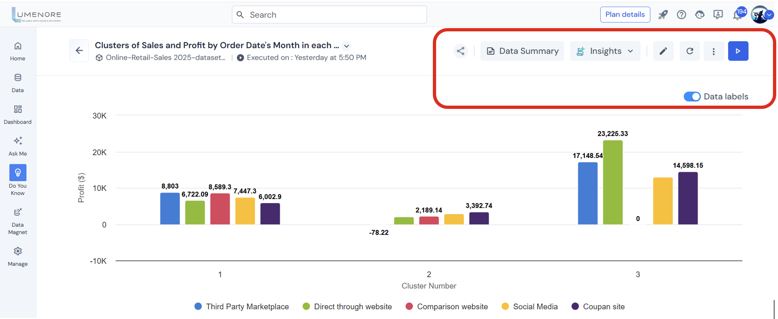
Upon completion of the execution process, you’ll arrive at the final page displaying the insights obtained. Positioned at the top left corner of each insight page, you’ll find a range of functions available for your convenience. These functions include options to share insights, expand the screen for a larger view, access detailed insights, edit, execute, and more.
Share
The “Share” functionality allows users to share charts or visualizations from the data analytics platform with team members or collaborators, facilitating collaboration, feedback, and collective decision-making. The sharing options available are In-app, WhatsApp, and Teams.
Follow the below steps to use the share option:
- Click on “Share.”
- Choose the “Sharing option.”
Case 1: In-app
- Add users and groups to the in-app.
- Use “@” to mention specific names.
- Use “#” to include entire groups.
- Add a comment if needed.

Case 2: WhatsApp
- Add users and groups to the in-app.
- Use “@” to mention specific names.
- Use “#” to include entire groups.
- Add a comment if needed.
Case 3: Teams
- Select the team channel on which you want to share the KPI.
- Add a comment if needed.

Note: Users can select all three sharing methods simultaneously.

Insights
Insight involves creating descriptive and explanatory narratives derived from data analysis. It aims to provide clear and understandable explanations of complex data patterns or trends, using storytelling elements to convey insights.
- Custom Insights
Custom insights are personalized analyses and visualizations that go beyond standard reports, enabling users to define specific metrics, build tailored visualizations, and segment data to answer unique business questions and create stakeholder-focused reports.

- AI Insights
AI insights are automatically generated by AI algorithms that analyze large datasets to identify patterns, trends, and anomalies. Using machine learning, these insights uncover data-driven observations and forecasts, revealing hidden opportunities and risks that may not be apparent to human analysts.
Edit
Users can modify the configurations needed to recreate the insights in this section. This includes adjusting parameters, selecting different data sources, refining filters, and changing visualization options to tailor the insights to their needs. By editing these configurations, users can ensure the insights remain relevant and accurate based on updated or refined criteria.
Click “Edit.”

Refresh
The refresh feature enables users to reload or update content, ensuring they view the most recent data or changes without needing to reload the page or interface manually.

Execute
This function allows users to run the configurations they have set up. By clicking “Execute,” the system processes the user’s specified parameters, data selections, filters, and other configurations to generate the desired insights or analyses. This action ensures that all the adjustments and settings made by the user are applied, producing updated results based on the most recent configuration.
Click “Execute.”

Note: If there’s a failure during execution, the reason for it appears just below the step where it happened. Users can reconfigure it to fix the issue.

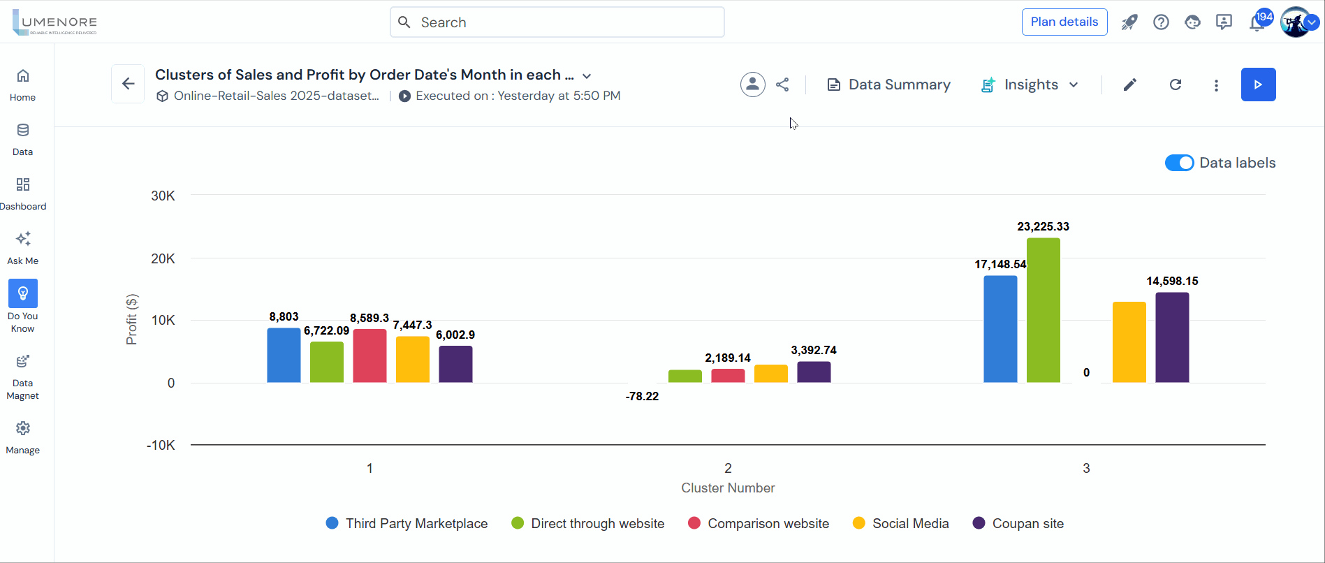
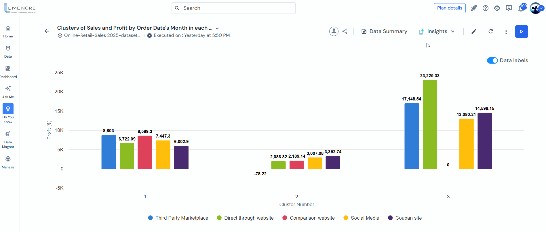
Data Labels
This feature enables users to toggle the display of data labels on charts. When enabled, data labels provide numerical values or specific data points directly on the chart, making it easier to visualize and interpret the information. This can be particularly useful for identifying exact values at a glance, comparing data points, and enhancing the overall clarity and readability of the chart. When disabled, the chart presents a cleaner look without the additional numeric annotations, which can be useful for simplifying the visual presentation when detailed values are not necessary.
Click “Data labels.”

Data summary
This feature provides users with comprehensive information about the data used in the analysis or visualization. It includes detailed statistics about the data’s size, such as the number of records and variables. It also assesses the quality of the data by highlighting aspects like completeness, consistency, and accuracy. Additionally, the data summary reveals relationships and correlations between different parts of the data, offering insights into patterns and connections that may not be immediately apparent. This summary helps users understand the context and characteristics of the data, enabling them to make more informed decisions and conduct more effective analysis.
Click on “Data summary.”

The Data Summary includes details, distributions, and missing values for all columns used in the analysis. The user can also download the summary.
The table below indicates which insights include the data summary feature:
| Insights | Data Summary |
| Trend Analysis | Available |
| Outlier Analysis | Available |
| Regression Analysis | Available |
| Correlation Analysis | Available |
| Forecast Analysis | Available |
| Classification Analysis | Available |
| Text Analytics Analysis | Available |
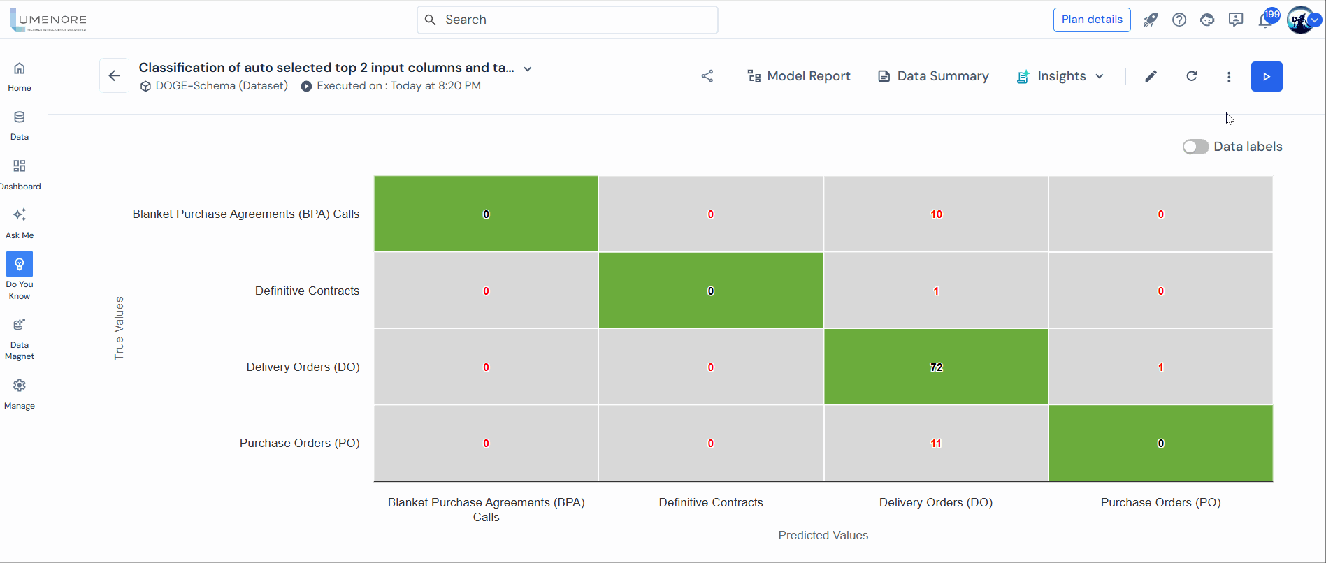
Model Report
The Model Report provides comprehensive details, metrics, and accuracy scores for models trained on datasets. This advanced feature is designed for data scientists and users with a basic understanding of machine learning. The Model Reports tool explains how the models were trained, their performance, and the factors influencing their accuracy. Users can interact with data, graphs, and metrics to gain deeper insights and make informed decisions, enhancing the overall utility of the models. The user can also download the report.
Click on “Model report.”

Within the data summary, users can access a comprehensive overview that encompasses data insights, including data overview, description, sample rows, category overview, and category description.
The table below indicates which insights include the model report feature:
| Insights | Model Report |
| Trend Analysis | Not Available |
| Outlier Analysis | Not Available |
| Correlation Analysis | Not Available |
| Forecast Analysis | Not Available |
| Classification Analysis | Available |
| Regression Analysis | Available |
| Text Analytics | Only in the case of sub-type text classification |
Create a copy
This option duplicates the insight, enabling you to experiment with different functions, settings, and configurations without impacting the original insight. By creating a copy, you can explore alternative scenarios, test changes, and adjust freely while preserving the integrity and original state of the initial insight. This feature enables the conduct of what-if analyses, comparing different approaches, or developing new insights based on the original data and configurations.
Select More options > Create a copy.

Add to favourite or Remove from favourite
This option allows users to manage their preferred insights by adding or removing them from the home page and favorite list. When an insight is added as a favorite, it appears prominently on the home page or in a dedicated favorites section, making it easily accessible for quick reference. Conversely, removing an insight as a favorite removes it from these prominent locations, although users can access it through other means. This feature lets users personalize their workspace, ensuring that their most frequently used insights are readily available for efficient workflow and analysis.
Select More options > Add to favourite.

Schedule
The schedule option allows users to automate tasks and alerts by scheduling configurations to execute at specified dates and times. This feature enables users to set up recurring or one-time schedules for executing configurations such as generating reports, running analyses, or sending notifications. By scheduling tasks through the scheduler, users can ensure the timely execution of operations without manual intervention, improving efficiency and ensuring that critical actions are performed at the right times.
Once scheduled, the user can view, edit, or delete the schedule.
Select More options > Schedule.

Compare
This functionality empowers users to conduct comparative analyses by juxtaposing insights configured with different settings or parameters. Users can gain deeper insights into variations, trends, or anomalies across different datasets or periods by enabling such comparisons. This capability enhances the effectiveness of analysis by facilitating side-by-side evaluations, thereby supporting more informed decision-making and strategic planning based on comprehensive insights. The user can also download the comparison.
Select More options > Compare.

Delete
This option enables users to remove insights from the system permanently. By using the delete option, users can effectively clean up their records by removing insights that are no longer needed or relevant.
Select More options > Delete.

Email me
This feature enables users to send the insight directly to their email address. By selecting the “Email Me” option, users can conveniently receive a copy of the insight report or visualization in their email inbox. This functionality enables the sharing of insights with colleagues or stakeholders, facilitating collaboration and communication around key findings. It also allows users to archive insights for future reference or analysis, enhancing flexibility and usability in sharing critical information.
Select More options > Email me.
Convert to grid
This function transforms a chart into a tabular or grid format, facilitating easier viewing, analysis, and data manipulation. By converting the chart to a grid, users can interact with the data in a structured table format, which may include additional details or attributes not readily discernible in the visual chart representation. This capability enables a more detailed examination of data points, facilitates comparisons between values, and allows for operations such as sorting, filtering, and exporting data for further analysis or reporting purposes.
Select More options > Convert to grid.

Export
This feature allows users to export the chart in PDF, Image (e.g., PNG, JPEG), and CSV (Comma-Separated Values) formats. Users can save the chart in a format that suits their needs by utilizing the export function, whether for sharing with colleagues, embedding in presentations or reports, or further analysis in external tools. This capability enhances the versatility of the chart data, making it accessible in different contexts and facilitating seamless integration into various workflows and communication channels.
Select More options > Export.

