Geo Map
A Geo Map, short for “geographic map” or “geospatial map,” is a type of data visualisation that displays data and information in the context of geographic or spatial locations. These maps represent data using visual elements such as points, lines, shapes, or colors on a map, making it easier to understand how data is distributed across different regions, locations, or areas.
Geo maps are analytics tool that are commonly used in various fields, including geography, business, public health, urban planning, and environmental science, to analyse and communicate information related to geography.
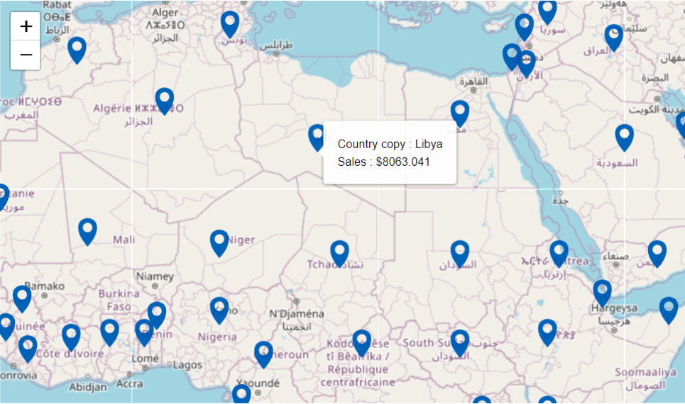
Map Chart
A Map Chart is a type of chart or data visualisation that presents data on a geographic map. Instead of displaying data in traditional numerical or graphical formats, map charts use maps to visually represent data, making it easier to understand spatial relationships, geographic patterns, and regional variations in data.
Example: The image below displays a map chart of the country and its sales.
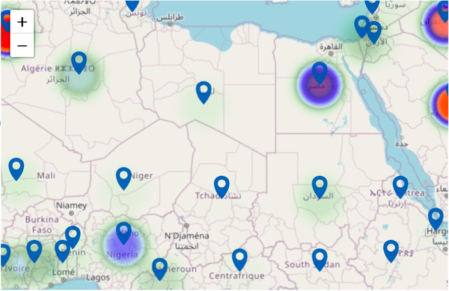
Heat Map
A Heat Map is a graphical representation that uses color variations to show the density or intensity of certain data points or events across a geographical area. It typically overlays colors onto a map, where the colors indicate the concentration or frequency of occurrences in specific areas. In essence, heatmaps on maps visualize the distribution or density of data, making it easier to identify hotspots or patterns within a geographic region.
Example: The chart below facilitates the company in assessing service sales on a country-by-country basis.
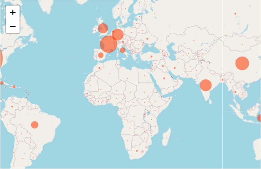
Bubble Map
A Bubble Map is a graphical representation of data on a geographic map using bubbles or circles. Each bubble on the map represents a specific location or geographic entity, and the size of the bubble is proportional to a specific data value. Bubble Map is useful for visualizing data in a geographic context, showing variations or patterns across regions, and making it easy to understand data points about their geographical location.
Example: The chart below facilitates the company in assessing service sales on a country-by-country basis.
Scatter Map
A Scatter Map is a type of data visualisation that combines the characteristics of a scatter plot with a geographic map. In a Scatter Map, data points are represented as individual dots or markers on a map, and the position of each dot corresponds to its geographic area. Each data point on the map typically represents a specific geographic coordinate or location and is associated with additional data attributes, such as values, categories, or labels.
It is particularly useful for showing the spatial distribution of data, identifying patterns or clusters across a geographic area, and understanding relationships between data points and their location on a map.
Example: The chart below facilitates the company in assessing service sales on a country-by-country basis.

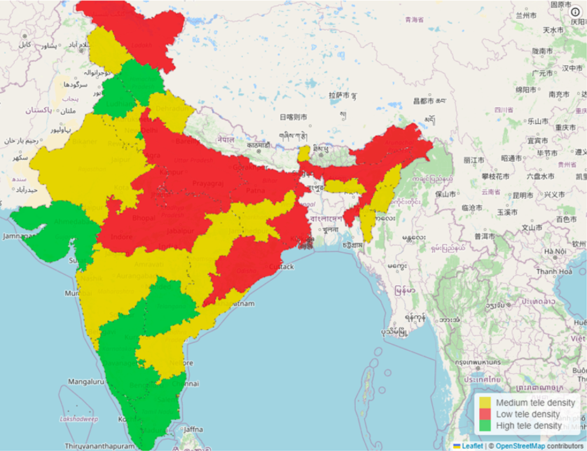
Choropleth Map
A choropleth map is a type of thematic map that uses colors or shading to represent the spatial variation of a specific data variable across geographic regions, such as countries, states, or counties. The term “choropleth” comes from the Greek words “choros,” meaning area or region, and “plethos,” meaning multitude.
Example: The chart below facilitates the company in assessing service sales on a country-by-country basis.