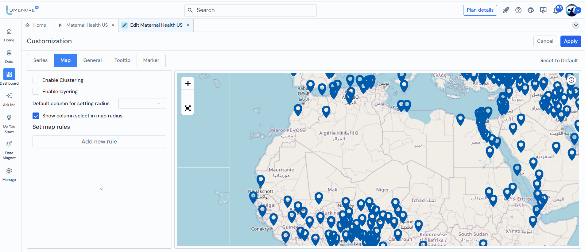
Dynamic geofencing
This unique feature is called “Dynamic Radius Size and Filter.” This feature lets users change the sizes of circles on a map. These circles represent different areas around specific places on the map. Users can change circle sizes even after they’ve published the map. This helps them study different situations by seeing how many data points are inside each circle. Also, users can choose which information they want to show inside these circles, making the map easier to understand.
Users can change circle sizes directly on the map through the map radius feature. This is important for our customers’ needs because it gives users more control, making their work much more flexible.
Steps to use map radius:
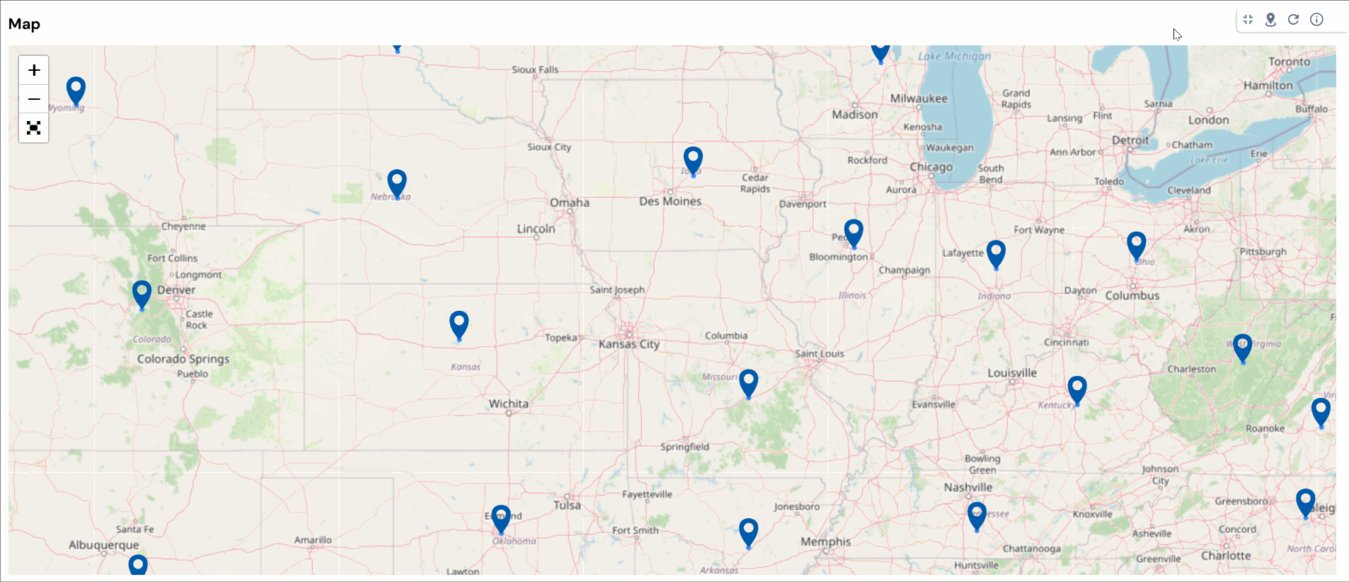
Step 1: Select the map radius icon at the top of the map chart, which is available after publishing the dashboard.

Note: This feature is only available for simple maps.
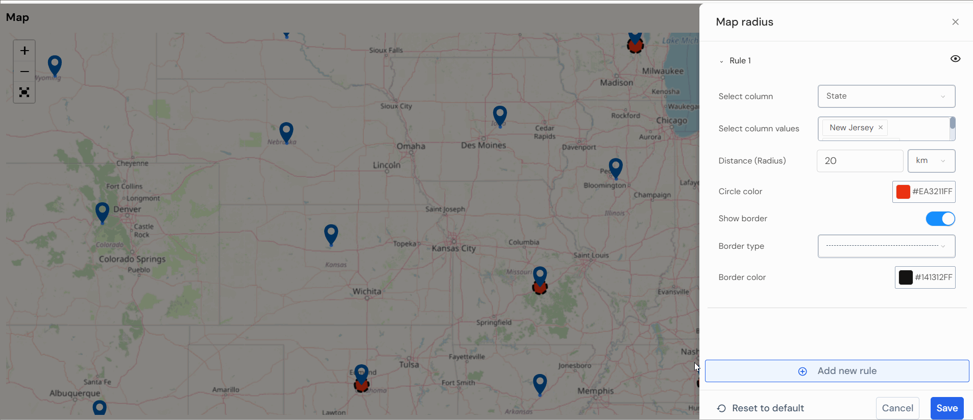
Step 2: Fill in the details mentioned below:
- Select column: The user needs to input specific measures, like the state, for example.
- Select column value: Choose the columns of data for displaying radius circle groups on the map.
- Distance: Establish a personalized radius and unit for a map circle to enhance analysis for a specific column.
- Circle color: Select the color for the chosen radius.
Note: To display the radius border, kindly enable it and choose the desired border type and color. Alternatively, you can disable it based on your preference.
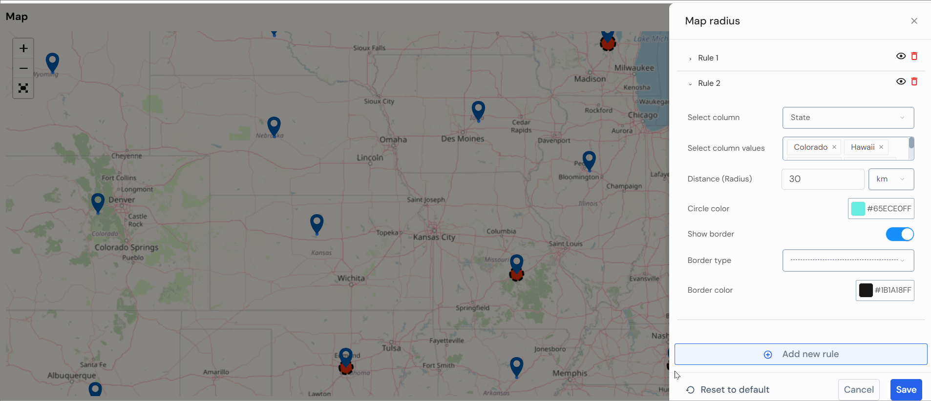
Similarly, you can add another radius group by clicking on “Add new rule.”
Step 3: Users have the option to delete or disable the map radius group.

Step 4: Select “Save” to store the information and view the details on the map.
Outcome
You can view the results of the rule you’ve configured based on your specifications. These circles represent the radius around the state as defined in the rule.
Note: These modifications won’t be saved permanently. Each time you access the dashboard, you’ll need to re-add the radius group.
To select the column by default, set the measure while making the dashboard.
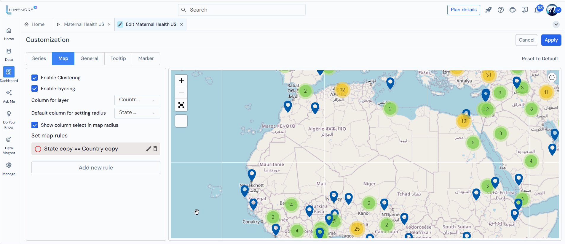
Step 1: Drag the attribute to the map, select the derived attribute from the “Derived Attributes” section, and set the chart type “Map.”

Step 2: The user can add an attribute to serve as a layer, along with one measure. After selection, click on “Customization”
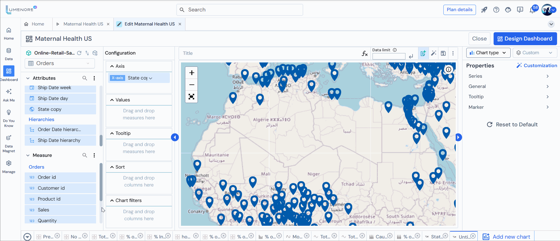
Step 3: Select “Map.”
Step 4: Enable clustering refers to grouping similar data points or items into clusters, allowing for more efficient analysis, management, or processing. In machine learning, clustering is an unsupervised learning technique that aims to identify natural groupings in the data based on similarities among the data points.
When you “enable clustering” in a tool or system, you usually activate or allow the system to automatically group data into clusters. This can help in various scenarios, such as segmenting customers, detecting patterns, or simplifying data for further analysis.
Step 5: Enable layering allows multiple layers within a system or application, whether in data visualization, graphic design, networking, or software development. It helps organize and manage different elements independently, making complex processes easier to handle and visualize. By stacking or separating various components, layering provides a structured approach that enhances clarity, flexibility, and efficiency in design and functionality.
Step 6: Choose the column for the layer.
Step 7: Choose the default column to set the radius per your requirement.
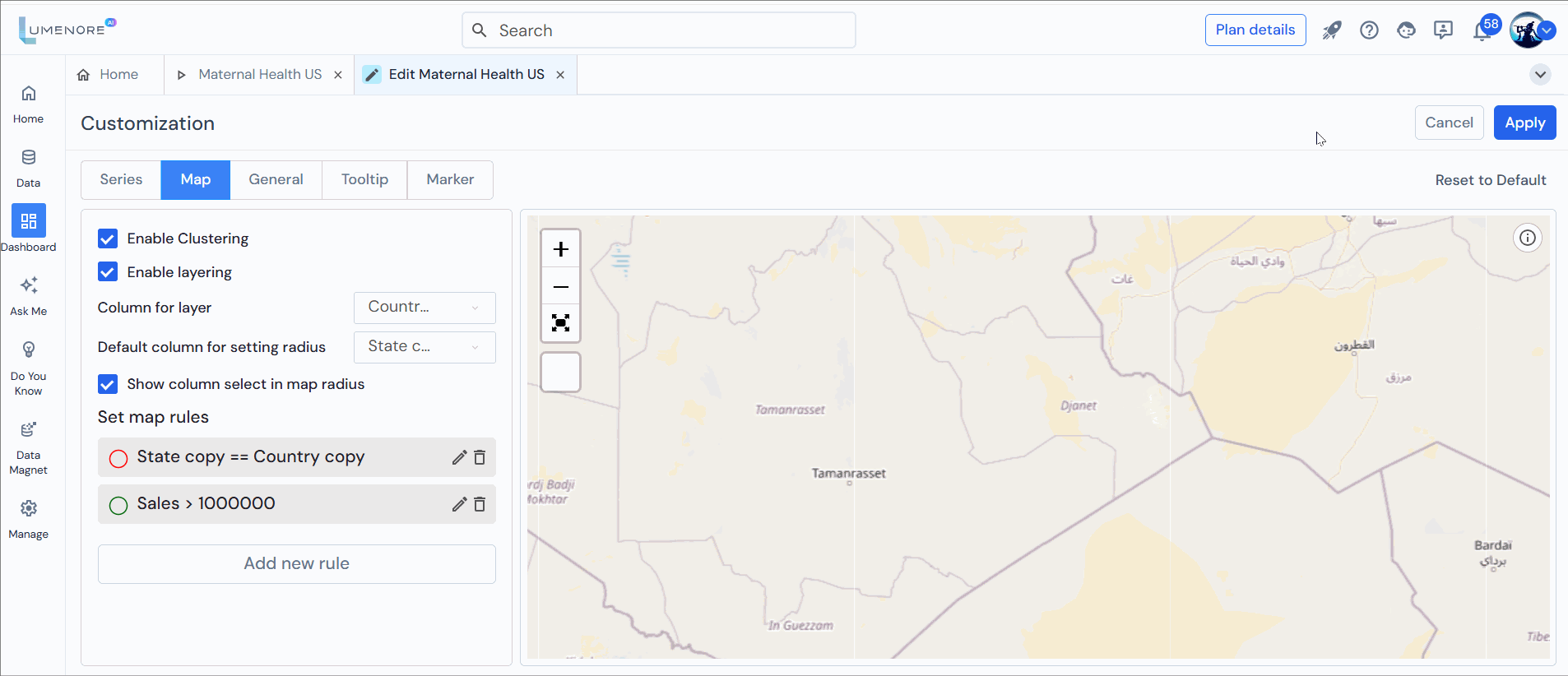
Step 8: Add new rule
- Select table column: Choose the main field from your dataset to base the rule on.
- Select condition: Defines the logical test used to compare values.
Options could include:- Is equal to
- Is not equal to
- Contains
- Starts with, etc.
- Select condition type: Specifies how the comparison will be done:
- Other dimension from table – compare against another column in the dataset.
- As Value: Compare against a fixed entered value.
- Select icon/circle: Specifies how the matched data points will be shown on the map:
-
- Can choose shapes like Circle or Icon
In the case of Circle:
- Circle radius (in meters): Defines the size of each circle on the map.
- Circle type: Allows you to define whether the circle is solid or boundary-only.
Options are: Dashed and Plain.
- Circle color: Choose the color for your circle/icon.
In the case of Icon:
- Select Icon Type: Choose the shape or symbol used for the data point instead of a circle. Options include marker, start, etc.
- Apply: Saves and enforces this rule on your visualization.
- Cancel: Discards the configuration.
Add Rule Example 1

Add Rule Example 2:
Step 9: Select “Apply” to save the settings and publish the dashboard.
Step 10: Click “Design Dashboard” to add the KPI to the designer page, where you can utilize the layering feature by selecting or deselecting countries. The states of selected countries are only visible on the map when layering is applied.
Note: Clicking the “i” icon in the top right corner of the KPI provides information about locations that couldn’t be mapped within the KPI.
Step 11: Publish and view the dashboard.

Step 12: The user can perform various other functions, such as maximizing the KPI,
Step 13: Select the map radius icon to view the changes once the dashboard is published.
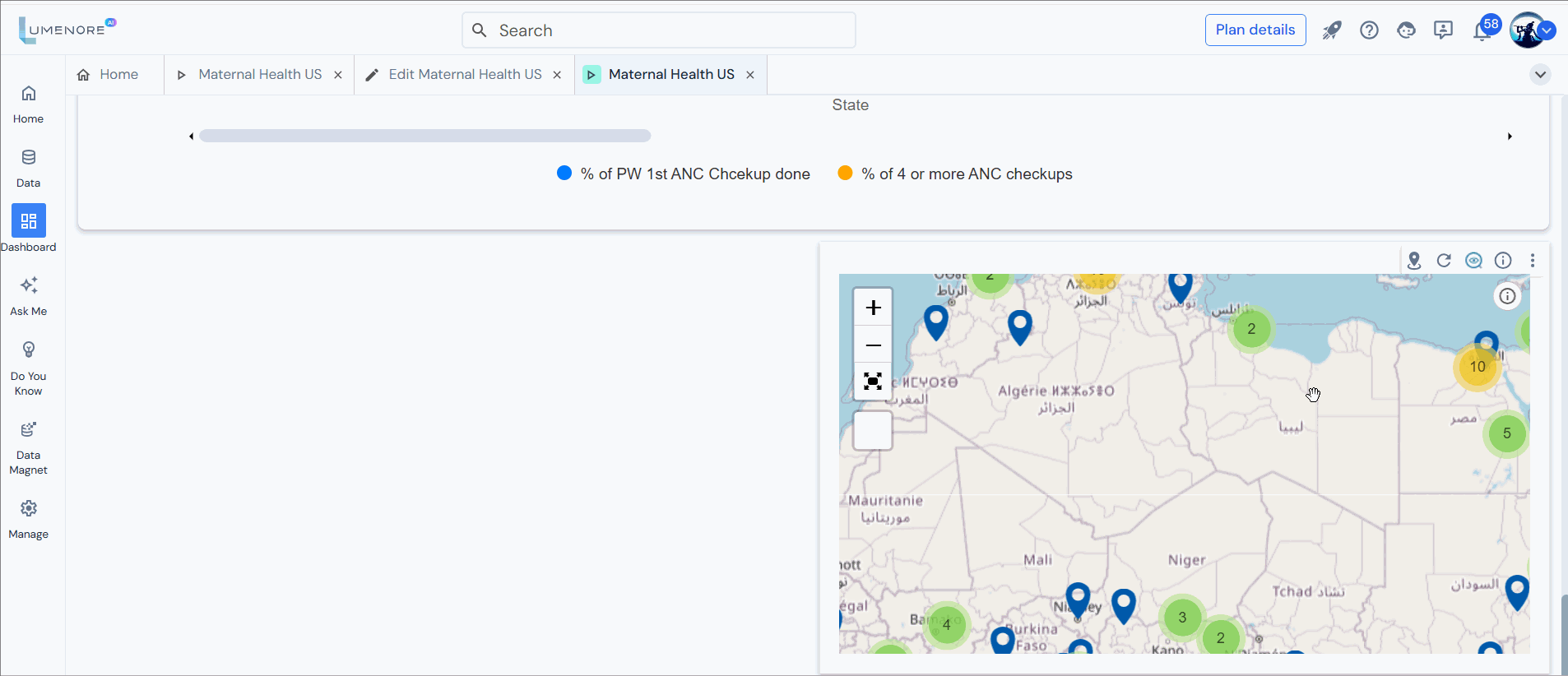
Note: The selected column value is already predetermined. You need to choose the column values.
