Insights & description
AI Insights
AI insight involves using artificial intelligence to analyze data and produce meaningful insights. AI uses machine learning algorithms and advanced analytics to identify patterns, trends, and correlations within large datasets. These insights aid decision-making, predicting future outcomes, and uncovering hidden opportunities or risks. AI insights offer more efficient and accurate analysis compared to traditional methods, providing valuable information for businesses and individuals.

To generate AI Insights:
- Click on the “Insight” icon and choose “AI Insights.”
- Select “Generate.”
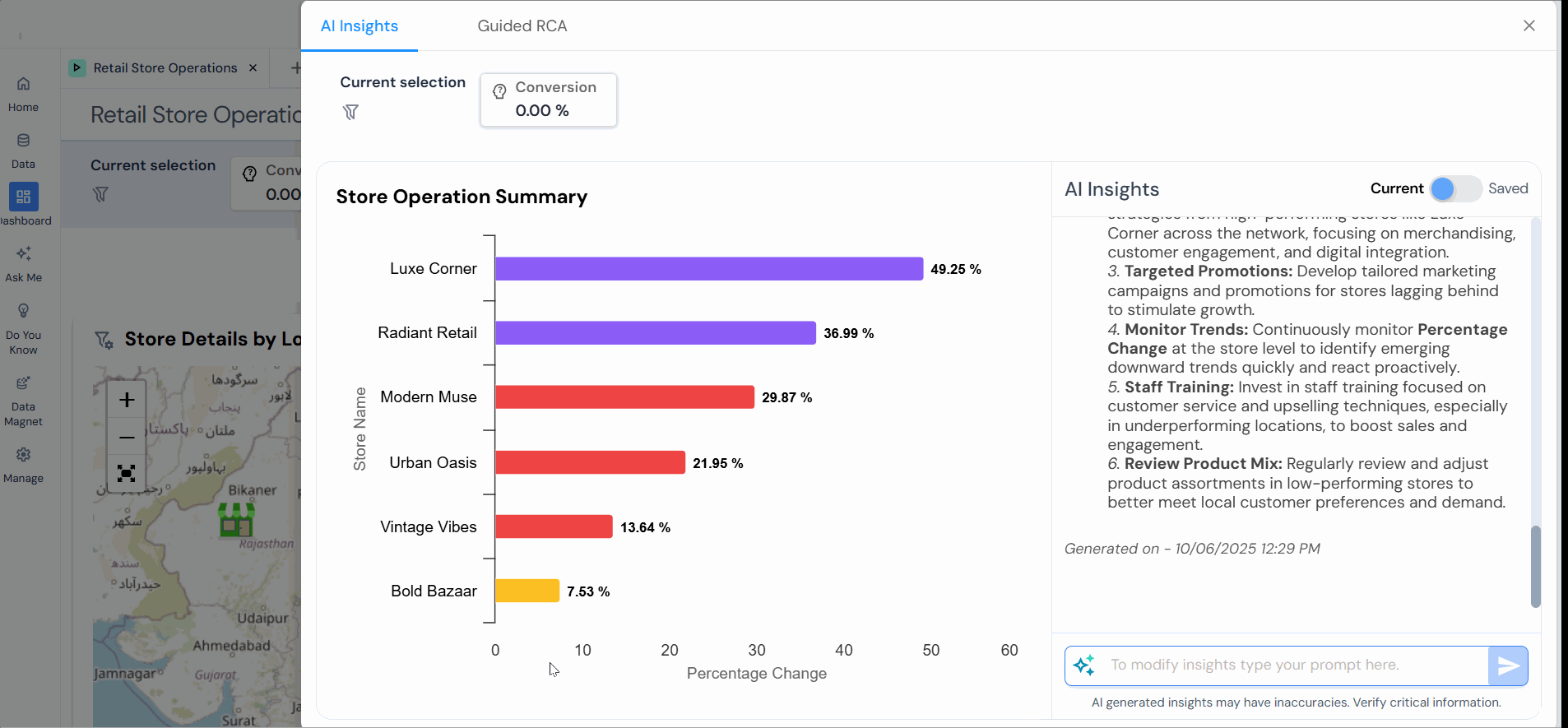
Note: Toggle for “AI Insights” with two states: “Current” and “Saved.” The “Current” state displays real-time, active insights generated by the AI, which can be updated as new data is processed. The “Saved” state shows archived or finalized insights that are no longer being actively updated. This toggle lets users easily switch between the latest and previously stored insights.
If you have configured custom insights during development, you can also access them.
Guided RCA (Root Cause Analysis)
Guided Root Cause Analysis (RCA) is a methodical way to find the root causes of problems in a system or process. It uses specific steps, methods, and tools to systematically explore possible causes, analyze data, and identify the main issue. In a guided RCA, software or an expert often helps by providing prompts, templates, and advice to ensure a thorough and efficient analysis. The goal is to uncover the main reasons for a problem so that practical solutions can be implemented to prevent it from happening again.
To generate Guided RCA:
- Click on the “Insight” icon and select “Guided RCA.”
- To generate a new set of guided RCAs, click “Generate.”

The prompt appears at the bottom of both insights as a text box with the message “To modify insights, type your prompt here.” This suggests that users can interact with the AI system by typing prompts to adjust or generate insights based on their queries.
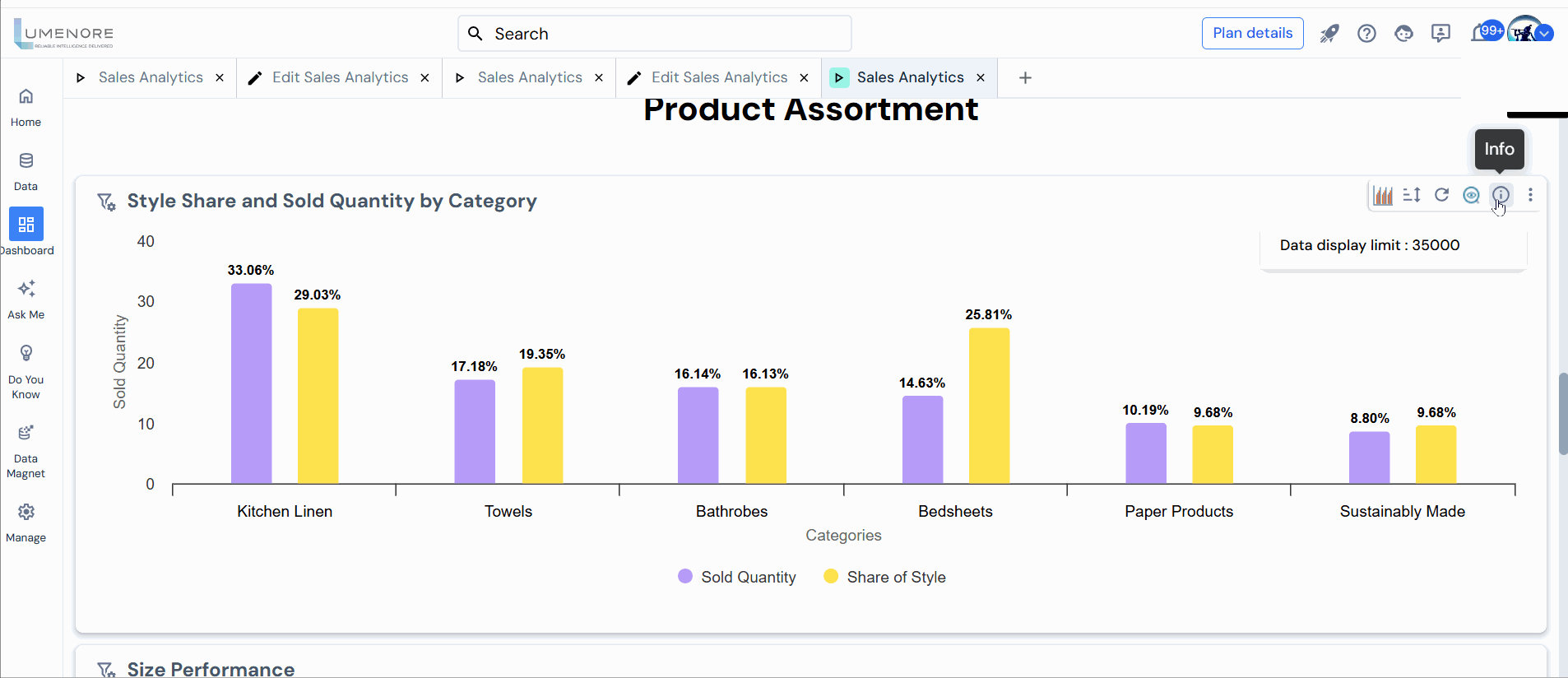
Information Icon
The information icon shows “data display limit,” which indicates the maximum number of data points on a chart. For example, the chart has a display limit of 35,000 data points. If the dataset exceeds this number, only the first 35,000 entries will be visualized, ensuring better performance and easier handling of large datasets.

To add additional information to a chart, click “Edit” on the dashboard, then select the “pencil icon” to enter a description. After publishing, this description will be visible to users through the info icon.