Curved Symbol Line Chart
A Curved Symbol Line Chart is a type of data visualisation that combines elements of a symbol line chart and adds curved lines to connect data points. In this curved line chart, a line connects data points, like a traditional Line and a sign chart or markers are placed at each data point of the data series. What sets it apart is the use of curved lines to connect the markers, creating a smoother, curved appearance.
The line in a Curved Symbol Line Chart helps to show the progression or trend in data, often over time or along a continuous axis. The symbols or markers are positioned at each data point to emphasize specific values, and the curved lines connecting these markers make the chart symbols more visually engaging and help to smooth out the data’s representation.
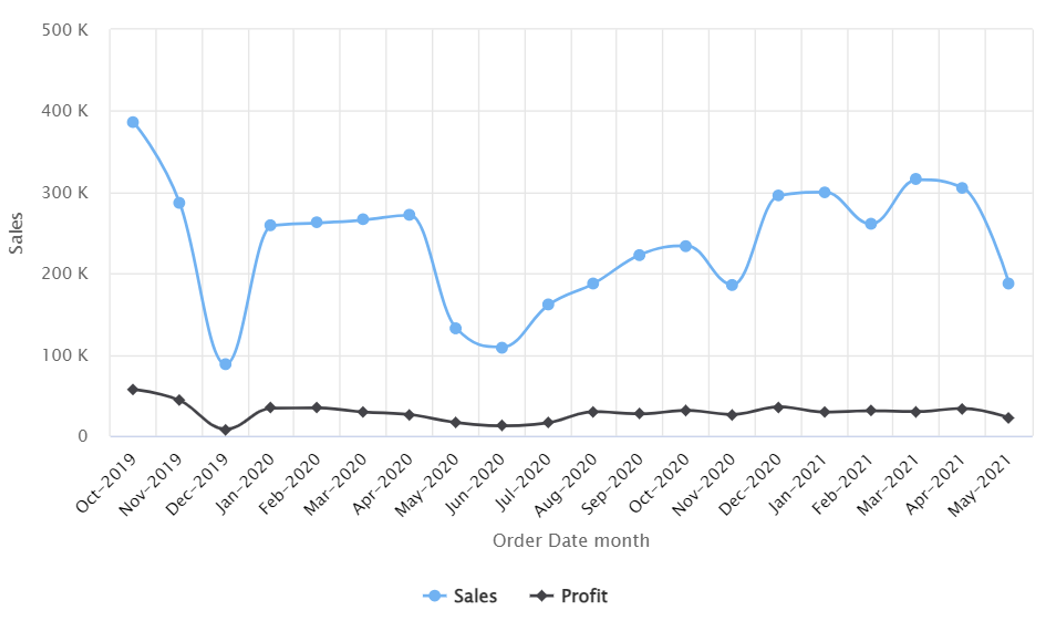
Example: The company aims to analyse its service categories, focusing on sales and profits. The Curved Symbol Line Chart analysis will provide insights into sales trends and profitability across time, enabling the company to make informed decisions regarding its services.
Horizontal Curved Symbol Line Chart
Vertical Curved Symbol Line Chart

