Chart property: Line chart
A line chart displays data as a series of points connected by straight lines. It is often used to show trends over time or other continuous data.
- Line charts help show changes in data over a period and can be used to compare multiple data sets. They are also commonly used in the financial, stock market, and scientific data analysis.
- Line charts also identify significant events or changes that occur at specific points in time. It is also used in Scientific experiments or surveys, such as changes in population or temperature.
Multi-line Chart
A multi-line chart, also known as a line graph or line plot, displays multiple data series or variables as separate lines on a graph. It is commonly used to visualize and compare trends, patterns, or relationships between variables over time or any continuous axis.
Here are some key aspects of a multi-line chart:
- Representation of Multiple Variables: A multi-line chart allows the plotting of multiple variables or data series on one graph. A unique line represents each variable, and the position of each point on the line reflects the variable’s value at a particular time or position along the axis.
- Variable Comparison: The primary purpose of a multi-line chart is to compare how different variables behave. By showing multiple lines on a single graph, it becomes easy to evaluate the relative movements, values, or relationships between the variables, highlighting both their similarities and differences.
- Labels and Legends: It is crucial to label each line clearly with a descriptive name to identify the corresponding variable. Including a legend that explains the color or pattern assigned to each line is also helpful for accurate interpretation. These elements make the chart more accessible to viewers.
- Interactivity and Exploration: Interactive charting tools can offer advanced features, such as drill-down options and tooltips, in multi-line charts. These allow users to click on specific data points for more detailed information, enabling deeper analysis.
- Trend Analysis: Multi-line charts are excellent for analyzing trends over time or along a continuous axis. They allow you to plot and compare the behavior of multiple variables, making it easy to identify and understand trends, patterns, or changes over a specific period. This is useful for analyzing stock prices, sales figures, temperature variations, or other time-based data.
- Comparative Analysis: Multi-line charts are ideal for comparing multiple variables or data series side by side. Plotting different variables on the same chart allows you to compare their values, movements, or relationships quickly. This is valuable for analyzing market trends, comparing product performance, or evaluating the impact of various factors on a specific outcome.
Advance Properties of Multi-line Chart:
The user must select one attribute and at least two measures. Based on your data and requirements, choose a chart. To customize the multi-line chart’s advance properties, click “Customization.”
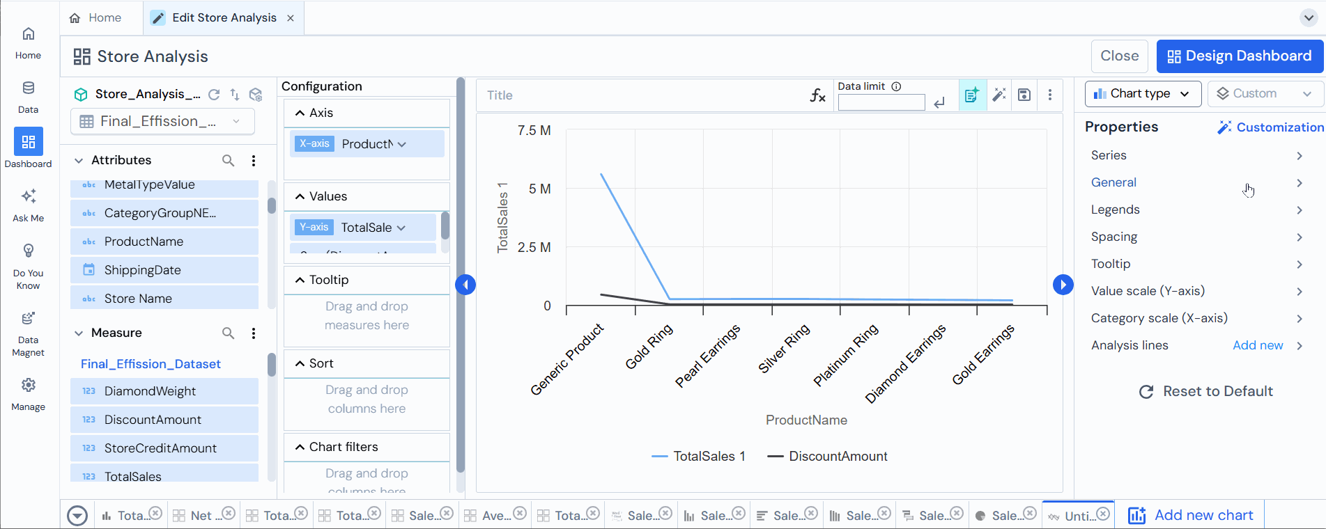
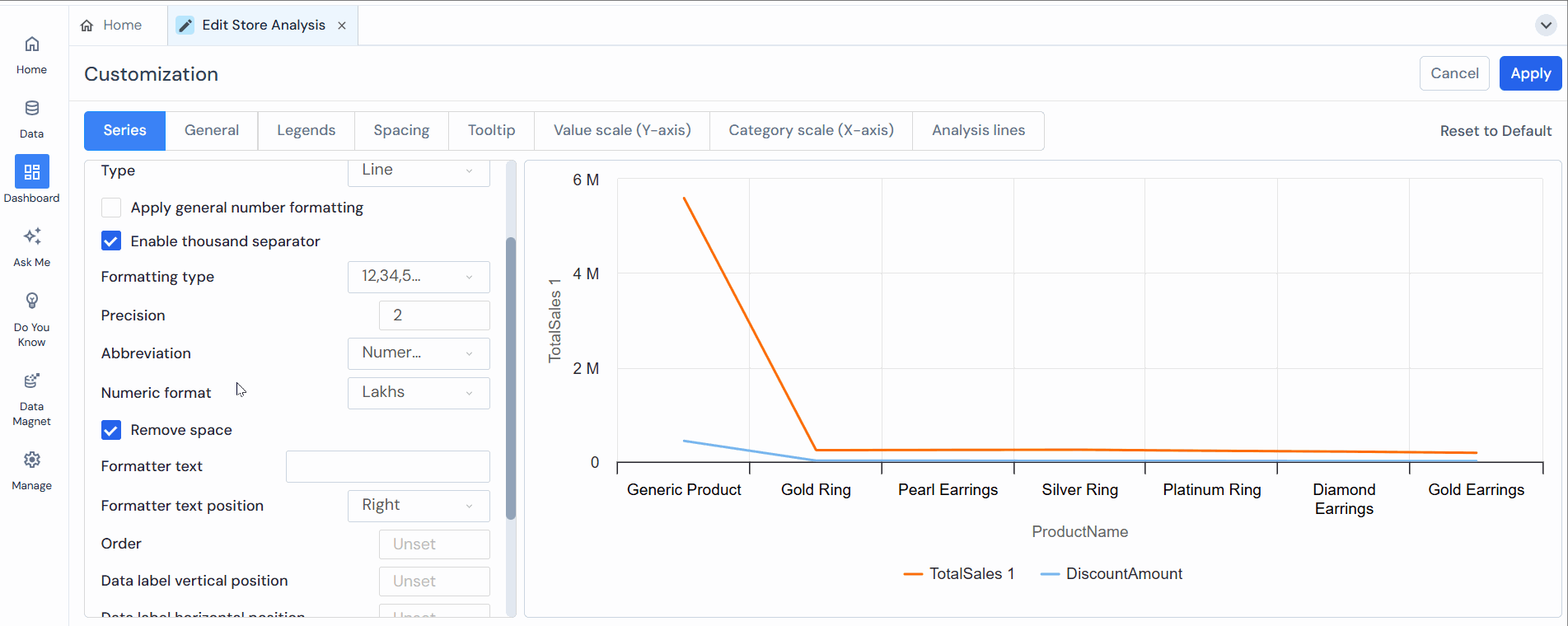
Series
In Series, the user can customize the properties of the selected series.
Users can customize the chart with following options:
- Select the attribute type from the “drop-down” menu (For example, we have selected profit).
- Color:The color the user wants to give to the selected attribute line.
- Negative Color: If the data has negative values, the bar will be inverted in the negative direction.
- Type:To ensure feasibility, the user can change the chart type directly from the drop-down menu. The menu offers spline, bar, column, and line charts as options.
- Apply General Number Formatting: This feature allows users to format numerical data consistently across a dataset or chart. Check this box to enable it.

- Enable Thousand Separators: This will add a thousand separators to the value shown in the chart. For example, if the value is 285082, it will be shown as 285 082 after applying a thousand separators.
Note: “This option becomes available when you uncheck the ‘Apply General Number Formatting’ box.” - Precision: Add the values shown after the decimal. For example, if the user 2, the value will be displayed as 7564.26; if entered 3, the value will be 7564.261.
- Abbreviation: The user can add an abbreviation to the value shown in the chart. There are None and Auto options available. In None, the value in the chart will be displayed as 285082, and in the Auto option, it will be shown as 285.08K.
- Numeric format: Refers to how numbers are displayed on a chart. Options include none, auto, thousands, millions, and billions. Users can choose the appropriate data points format based on their needs.
- Remove Space: Removes any spaces between numbers and units/abbreviations (e.g., shows 100K instead of 100 K).

- Formatter Text: To add the format text with the value. For example, the user can enter “$” in the formatted text box if the value is in the dollar.
- Formatter Text Position: The user has two options to position the formatted text: Right and Left. For example, if the value is 285, 082K, and the user selects Right, then the output will be shown as 285, 082K$, where $ is placed at the right side of the value.
- Order: This is for ordering the visibility of the series. For example, in a line+ grouped chart, if a user selects order 2 for the line series and 1 for the bar series, then the Line will be shown overlapping the bar. This chart property works only when the user selects grouped charts.
- Data Label Horizontal Position and Data Label Vertical Position refer to the placement of data labels on a chart relative to the data points they represent.
- Hide Series: This option hides the selected series whose name is shown in the drop-down; the user can change the series to hide as required. For example, if the user selects the “Profit” series, the Profit series in the chart will be hidden if the user checks the Hide Series option.
- Set Color Rules (Add New Rule): This applies conditional formatting to the grid or chart, where the user can set different colors according to the rule/conditions set. Details of the same are given below: Users can apply “Conditional Formatting” in a grid or chart by clicking “Add New Rule”.
- Select Table Column: When creating the chart, the user needs to select the column corresponding to the chosen measure.
- Select Condition: Setting the condition for applying the formatting. This contains the following conditions:
- Is equal to
- Is less than
- Is less than equal to
- Is greater than
- Is greater than equal to
- Is not equal to
- In Between
- Is Null
- Select Condition Type: The user will select the condition here. The options available are “As value” or “Other measures from table.”
- Value: The user has to set the value to apply the condition. It can be of any value as per the user.
- Icon: Select the icon type from the drop-down options.
- Icon color: Select the icon color. The user can also customize the color.

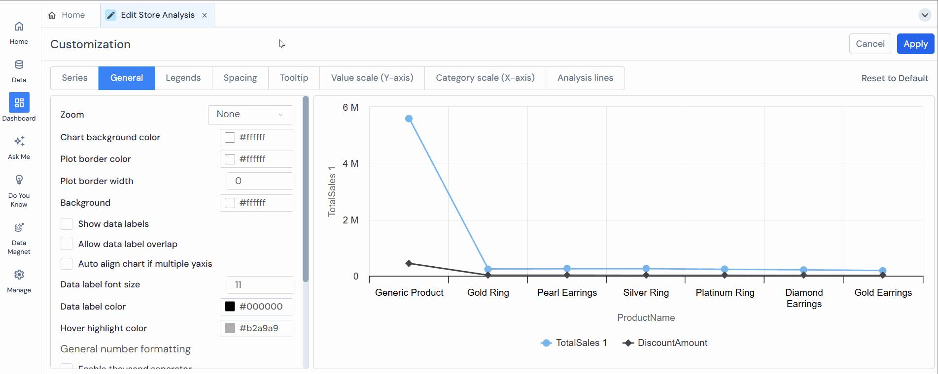
General
In General, the user can customize the general properties of the chart.
Users can customize the following options:
- Zoom:The user can zoom into the chart from different angles for a clearer view. First, the user needs to select the zoom option and then drag the part of the chart the user wants to zoom; the options are:
- Horizontal zoom: It will zoom horizontally to the part of the chart the user wants to zoom in by dragging it.
- Vertical zoom: It will vertically zoom to the part of the chart that the user wants to see by dragging it.
- Zoom for both axes: It will zoom to the part of the chart the user wants to zoom in by dragging it.
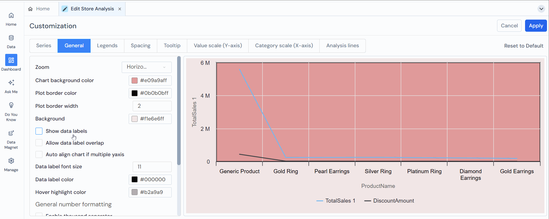
- Chart Background Color: The user can change the chart’s background color according to their needs.
- Plot Border Color: The color used for the border or outline of the plotting area in a chart. This border can help delineate the area where data points, bars, lines, or other visual elements are displayed, making the chart easier to read and visually appealing.
- Plot Border Width: Refers to the thickness or width of the border or outline around the plotting area in a chart. A thicker border can make the plotting area stand out more prominently, while a thinner border can provide a more subtle delineation.
- Background: Here, the user can set the background color.
- The user can enable the following:
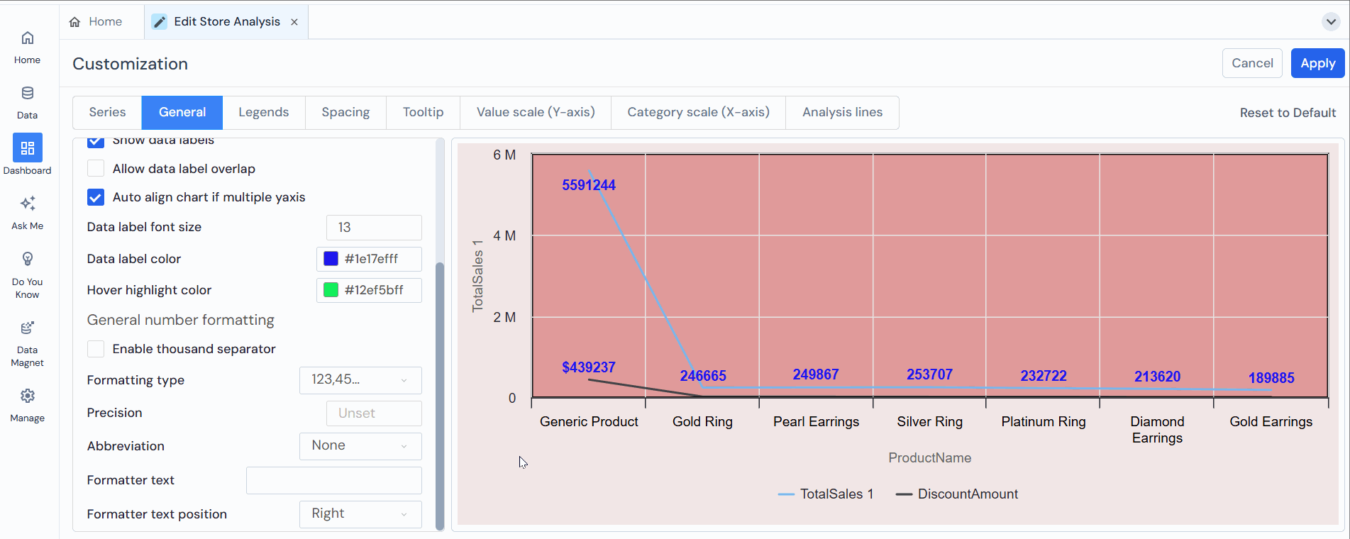
- Show data labels: This shows the labels on the top of the bar; the user can enable or disable it by checking or unchecking the box.
- Allow data label overlap: This setting controls whether data labels (names, values, or percentages) overlap on the chart or graph.
- Auto-align chart if multiple y-axis: This feature adjusts the chart’s alignment when multiple Y-axes are present. This feature ensures that the chart remains clear and readable by adequately positioning and scaling the axes.
- Data Label Font Size: Refers to the text size used for data labels on a chart. It determines how large or small the text appears when displaying numerical values or labels directly on data points, bars, or other chart elements.
- Data Label Color: This setting refers to the color used for the text of data labels displayed on a chart. It allows users to customize the appearance of the labels that accompany data points, bars, or other elements in a chart.
- Set Bar Width: This feature allows users to adjust the width of the bars in a bar chart. By setting the bar width, users can control the thickness or width of each bar displayed in the chart, influencing the visual presentation and density of the data represented.
- Hover Background Color:The user can change the point hover background color, which is visible when the user hovers on the chart. For example, here, we have selected grey.
- Enable Thousand Separators:This will add a thousand separators to the value shown in the chart. For example, if the value is 285082, it will be shown as 285 082 after applying a thousand separators.
Note: “This option becomes available when you uncheck the ‘Apply General Number Formatting’ box.” - Formatting Type: The user can change the data format to be viewed in the chart’s tooltip. The available formats are 123,456,789 and 12,34,56,789; the user can select the format based on whether it is feasible to see the data in the chart in the same format as specified.
- Precision: Add the values shown after the decimal. For example, if the user 2, the value will be displayed as 7564.26; if entered 3, the value will be 7564.261.
- Abbreviation: The user can add an abbreviation to the value shown in the chart. There are None and Auto options available. In None, the value in the chart will be displayed as 285082, and in the Auto option, it will be shown as 285.08K.
- Numeric format: Refers to how numbers are displayed on a chart. Options include none, auto, thousands, millions, and billions. Users can choose the appropriate data points format based on their needs.
- Remove Space: Removes any space between numbers and units/abbreviations (e.g., shows 100K instead of 100 K).
- Formatter Text:To add the format text with the value. For example, the user can enter “$” in the formatted text box if the value is in the dollar.
- Formatter Text Position:The user has two options to position the formatted text: Right and Left. For example, if the value is 285, 082K, and the user selects Right, then the output will be shown as 285, 082K$, where $ is placed at the right side of the value.
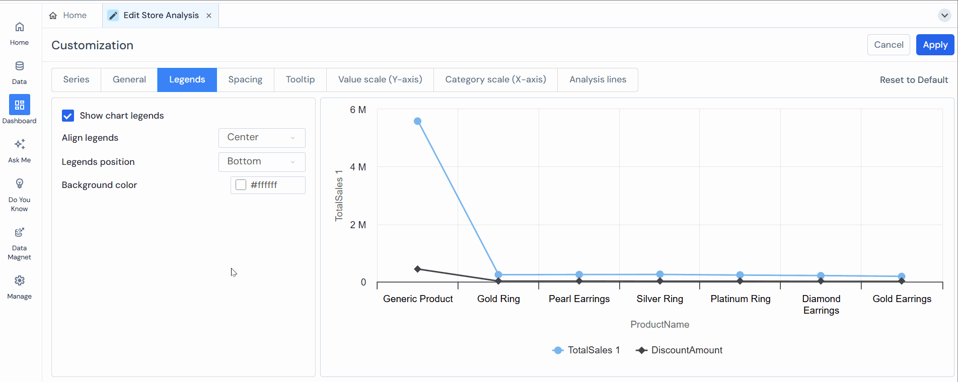
Legends
In Legends, the user can customize the legend’s chart properties.
Users can customize the following options:
- Show Chart Legends:Check or uncheck the box to enable or disable this option to show the chart legends. For example, in the below image, Segment is visible when we enable the chart legends.
- Align Legends:The user can align the legends to the left, center, or right. For example, we have aligned the legends in the center so they are visible in the center of the chart.
- Legends Position:The user can also change the legend’s position to the top, middle, or bottom. For example, we have selected the middle position for the legends.
- Legends Background Color:This is the color of the legend, which will be seen in the legend’s background. The user can select the color based on feasibility.
Spacing
In Spacing, the user can customize the spacing of the chart.
Users can customize the following options:
- Plot Border Width:The user can edit the plot border width as feasible.
- Margin Top:The user can customize the margin of the chart from the top. It is set to 0 as default; increasing the value will increase the margin from the top.
- Margin Bottom: The margin from the bottom can be customized by the user; it is also set to 0 as default, and increasing the value will increase the margin from the bottom.
- Margin Left: The user can customize the margin of the chart from the left. It is set to 0 as default; increasing the value will increase the margin from the left side of the chart.
- Margin Right:The margin from the right can be customized by the user; it is also set to 0 as default; increasing the value will increase the margin from the right side of the chart.
- Spacing Top:It defines the spacing of legends from the chart area. For example, if we increase the spacing from the top, the legend will be pushed downward.
- Spacing Bottom:It defines the spacing of legends from the chart area. For example, if we increase the spacing from the bottom, the legend will be pushed upward.
- Spacing Left:It defines the spacing of legends from the chart area. For example, if we increase the spacing from the left, the legend will be pushed more rightward.
- Spacing Right:It defines the spacing of legends from the chart area. For example, if we increase the spacing from the left, the legend will be pushed more leftward.

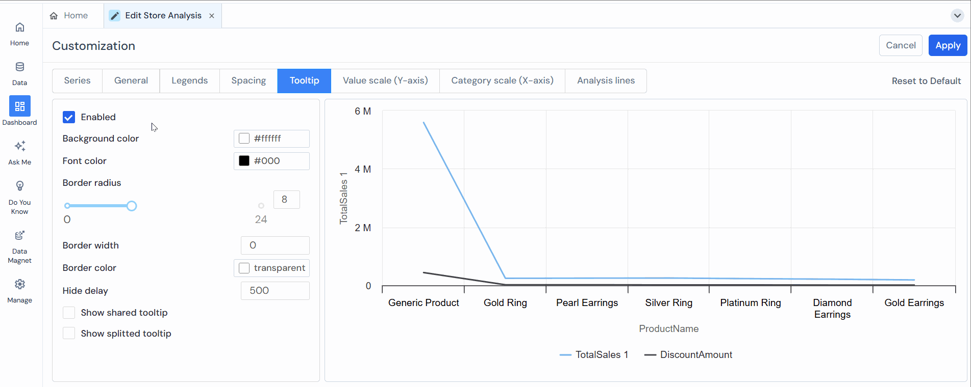
Tooltip:
In Tooltip, the user can customize the tooltip properties of the chart.
Users can customize the following options:
- Enabled:To enable the tooltip in the chart, the user has to check this box. After that, the user can see the tooltip when the user hovers over the chart.
- Tooltip Background Color:The user can change the tooltip background color.
- Tooltip Font Color:The user can change the font color used in the tooltip to match the background color.
- Tooltip Border Radius:The user can also change the radius of the tooltip box to get the tooltip appearance as per feasibility.
- Tooltip Border Width:To change the border width of the tooltip, the user can increase the value, and the border width will increase accordingly.
- Tooltip Border Color:The user can also change the border color of the tooltip.
- Hide Delay:This is to change the delay time of tooltip disappearance. The user can increase it to increase the delay time more or decrease it to decrease the delay time of the tooltip in a chart after the user hovers above it.
- Users Shared Tooltip:When enabled, this option shows the bar’s tooltip in a single box; the user can enable or disable this option by checking or unchecking the box.
- Show Splitted Tooltip:The user can enable or disable splitting the tooltip into two parts for each segment by checking or unchecking the box.
Value Scale (Y-axis)
Value Scale (Y-axis): the user can customize the value scale of the Y-axis in the chart.
Users can customize the following options:
- Grid Line Width:The user can change the width of the grid line of the Y axis in the chart; these are the horizontal lines presented at certain intervals.
- Scale Interval: The user can change the scale of the interval; the value after the interval will be there.
- Allow Decimal Scale: This feature determines whether a chart’s scale can display decimal values. When enabled, the chart’s axis can show numbers with decimal points, providing more precise data representation.
- Min Value:Set the minimum value of the Y-axis from where the Y-axis value begins in the chart.
- Max Value:To set the maximum value of the Y-axis from where the Y-axis value ends in the chart.
- Labels Font Size:Users can change the Y-axis label’s font size.
- Label:Same as font size, the user can also change the label of the Y-axis.
- Title Margin: The user can adjust the margin of the Y-axis title.
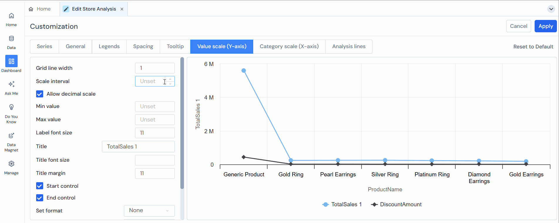
- Start Control:This is the initial point value for the Y-axis, which is visible in the chart.
- End Control: It represents the final point for the Y-axis.
- Set Format: This option allows users to define how data is displayed on a chart or graph. It typically includes the following formats: Numeric, Time format, and Logarithmic.
- Numeric format: Refers to how numbers are displayed on a chart. Options include none, auto, thousands, millions, and billions. Users can choose the appropriate data points format based on their needs.
- Label Color: This setting allows users to customize the color of text labels on a chart. Labels can include titles, axis labels, data point labels, and legends. Adjusting the label color helps improve readability, contrast, and the overall aesthetic of the chart, ensuring that the information is visible and visually appealing.
- Label Title Color: This setting allows users to customize the color of the title labels on a chart, such as the main title, axis titles, and section headers.

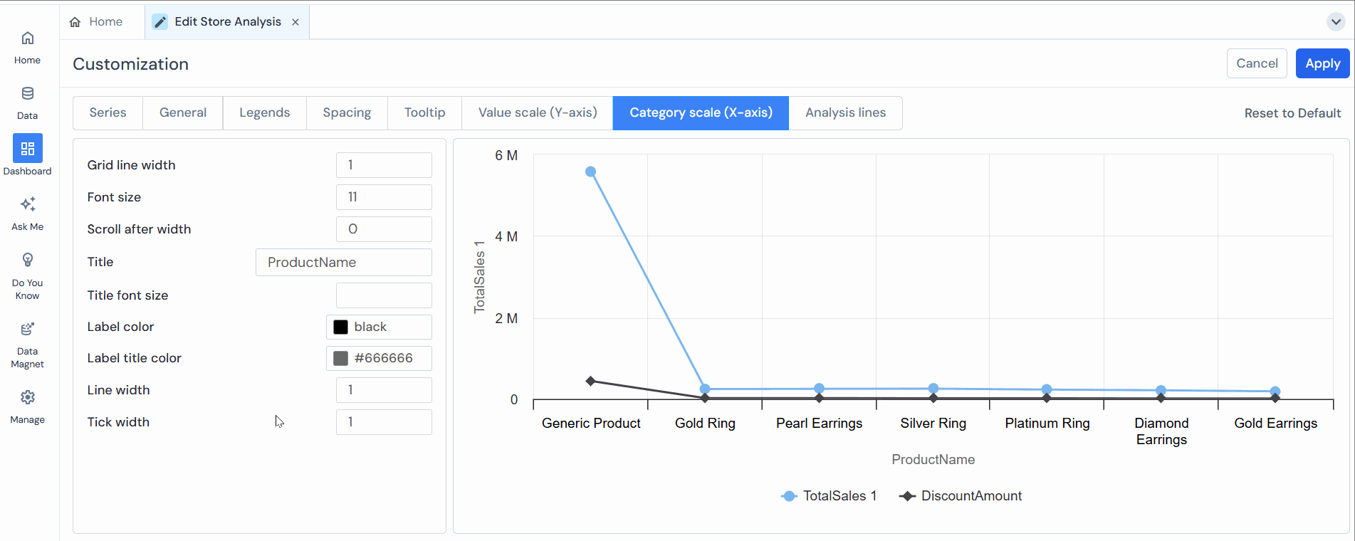
Category Scale (X-axis)
In Category Scale (X), the user can customize the category scale of the X-axis in the chart.
Users can customize the following options:
-
- Grid Line Width:The user can change the grid line width on the X-axis in the chart; these are the vertical lines presented on the X-axis.
- Labels Font Size:The user can change the label’s font size to X-axis.
- Scroll After Width: This allows the user to limit the number of bars shown on the chart. For example, if the user enters five as a value, the chart will show only five bars out of the total; to view more than five bars, the user must scroll. In a vertical bar chart, the user needs to scroll left to right; in a horizontal bar chart, the user needs to scroll up to down.
- Title:This is the title of the X-axis; the user can give the title of their choice.
- Label Color: This setting allows users to customize the color of text labels on a chart. Labels can include titles, axis labels, data point labels, and legends. Adjusting the label color helps improve readability, contrast, and the overall aesthetic of the chart, ensuring that the information is visible and visually appealing.
- Label Title Color: This setting allows users to customize the color of the title labels on a chart, such as the main title, axis titles, and section headers.
- Line width: It controls the thickness of the grid lines in the chart. Increasing it makes the horizontal and vertical guidelines behind the bars appear bolder and more prominent.
- Tick width: It controls the thickness of the tick marks on the axes. These are the small marks along the X-axis and Y-axis that indicate scale divisions. A higher tick width makes these marks more visible.
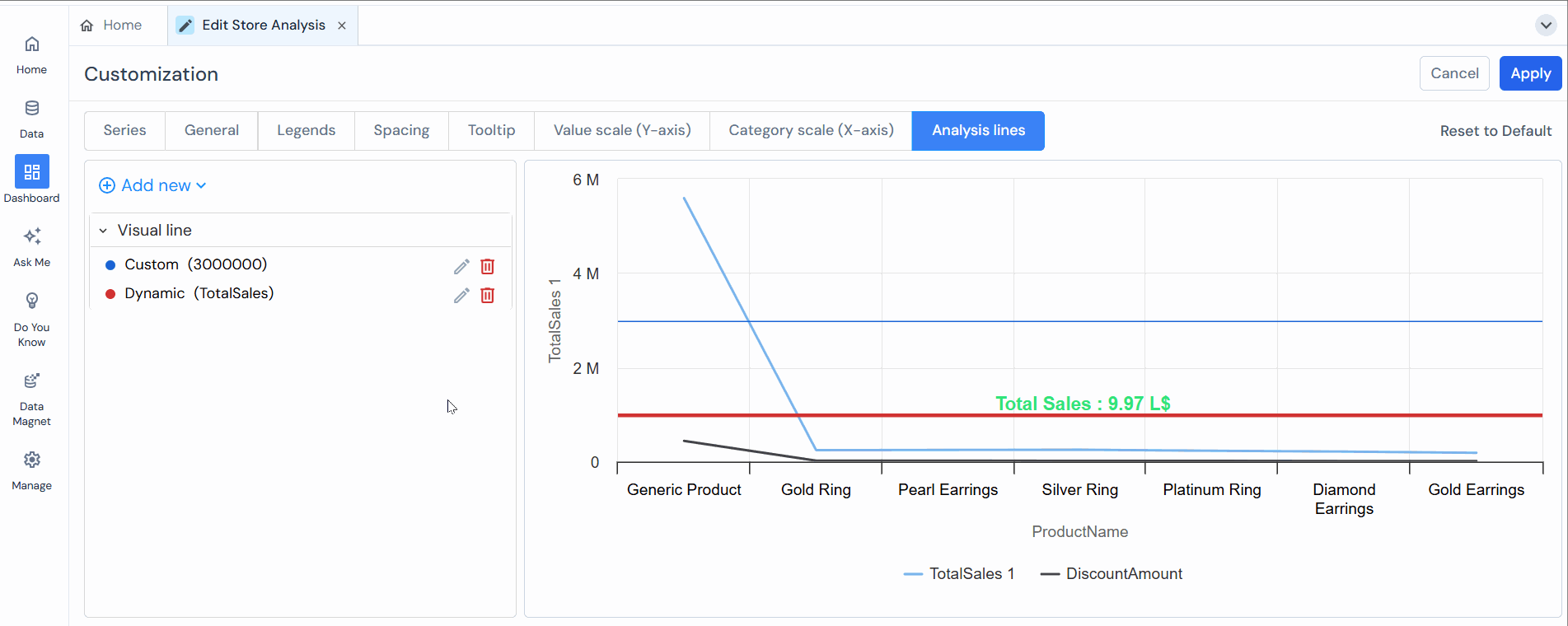
Analysis Line
Visual lines in a chart represent trends, patterns, or relationships between data points. They are commonly used in line charts, scatter plots, and other charts to visually connect data points and represent the data’s behavior over a continuous range.
Here are some critical aspects of visual lines in charts:
- Trend Representation:Visual lines in a chart can represent the overall trend or direction of the data. The line connects the data points in a line chart, allowing viewers to observe the data’s upward, downward, or flat trends. This helps in understanding the overall pattern or trajectory of the data series.
- Interpolation: Visual lines can be used to interpolate between data points, estimating the data’s value at specific points within the range. This is particularly useful when the data is unavailable for every moment, and you want to infer the values between the data points.
- Smoothness: The smoothness of the visual line can vary depending on the chart and the data being represented. In some cases, the line may be a straight connection between data points, while in other cases, it may be a curved or smoothed line that provides a more continuous representation of the data’s behavior.
- Highlighting Relationships: Visual lines can highlight relationships between data series or variables. For example, in a scatter plot, connecting the data points with lines can reveal correlations or associations between variables, indicating the strength and direction of the relationship.
The best usage of visual lines in a chart depends on your data analysis’s specific goals and context. Here are some common scenarios where visual lines can be effectively utilized:
- Trend Analysis: Visual lines help analyze trends over time or a continuous range. Line charts are commonly employed to showcase the progression of data points, enabling you to observe patterns, fluctuations, or overall trends. This is beneficial for tracking metrics such as sales figures, stock prices, or website traffic over a period.
- Comparative Analysis: Visual lines can help compare multiple data series or variables within a chart. Connecting the data points with lines lets you visually assess the relative performance or relationship between categories or groups. This is valuable when examining market share, comparing product sales, or evaluating performance across different regions.
- Storytelling and Data Communication: Visual lines can enhance storytelling and data communication by providing a straightforward narrative or highlighting critical points in the data. Using lines strategically can guide the audience’s attention, emphasize significant trends or turning points, and facilitate comprehension of your data story.
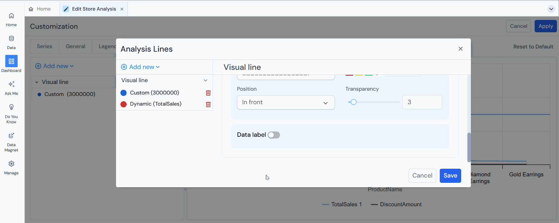
Steps to add analysis line:
- Click “Add New” to insert an analysis line.
- Next, specify the conditions for the analysis line by selecting the visual line type either custom or dynamic. For a custom visual line, enter the specific value. For a dynamic visual line, choose the measure to be used.
Let’s see both conditions:
Case 1: Custom Visual Line
In a custom visual line, the user can set the value manually.

Case 2: Dynamic Visual Line
In a dynamic visual line, the user selects a measure from the given measures and chooses the aggregate of Sum/Average/Minimum/Maximum.
- After selecting the chart type and entering the value, the user can choose the line style and color.
- Position: The user can select the position of the visual line, whether it will be visible in the front of the bars or at the back.
- Transparency: The user can increase or decrease the transparency of the visual line by dragging the slider.

- Data Label: This option allows the user to customize the data label options of the visual line. The user can enable or disable the data label by checking or unchecking the box.After enabling the data label, the following fields will appear:
- Color (Data Name): The user can change the color of the name given to the visual line.
- Font size: The font size of the data label user can increase or decrease as needed by simply clicking on + to increase and – to reduce the font size.
- Font style: Style of the data label font; the user can select from the three font styles- bold, italic, and underlined font.
- Show Data Name: By enabling this option, the user can add a name to the visual line by entering in the field provided.
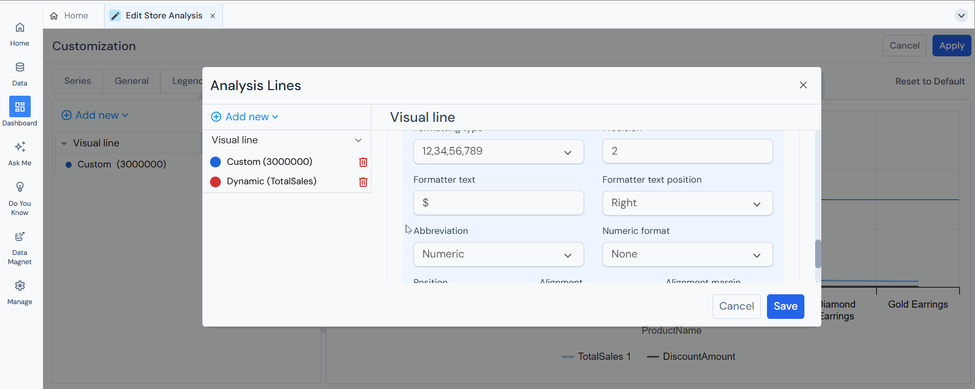
- Show Data Value: The data value entered by the user will be visible in the chart when this option is enabled. The user has to check the box to show the data value.
When you enable the “Show Data Value” option, the following settings are available:
-
- Enable Thousand separator
- Formatting type
- Precision
- Formatter text
- Formatter text position
- Abbreviation
- Numeric format
Note: Refer to the above explained section “General” for details.
-
- Position: The user can change the data label’s position and value from the visual line.
- Alignment: Same as position, the user can also change the alignment of the data name and value. There are three options- Left, Middle, and Right.
- Alignment margin: The user can align the margin of the data label from the chart plot; if the user increases the margin in a vertical chart, the data label will move towards the right side, and in the horizontal chart, the data label will move downward and vice versa.
Note: Similarly, users can create multiple rules for visual lines.
- Click the “pencil” icon to edit the visual line.
- Click the “trash” icon to delete the visual line.