Chart property: Word cloud chart
This is a visual representation of text data where the size of each word indicates its frequency or importance. It’s often used to highlight keywords or themes in a dataset, with the most frequent words appearing larger than less frequent ones. Word clouds are commonly used for sentiment analysis, social media analysis, or text mining.
Advance properties of word cloud chart
The user must select at least one attribute and measure for the plotting chart. Based on your data and requirements, choose a chart. To customize the selected chart, click “Customization” to access the advanced properties.

Series
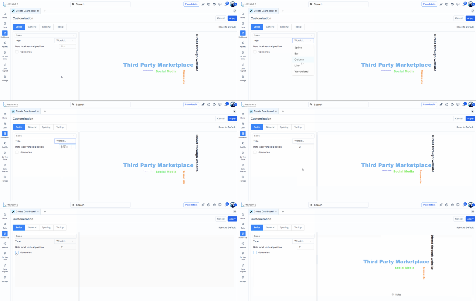
In Series, the user can customize the properties of the selected series.
Users can customize the following options:
- Select the attribute type from the drop-down menu (In case of more than one measure).
- Type: To ensure feasibility, the user can change the chart type directly from the drop-down menu. The menu offers spline, bar, column, line, and word cloud charts.
- Data Label Vertical Position: It refers to the placement of data labels on a chart relative to the data points they represent.
- Hide Series: It hides the selected data series or time series, of which the name is shown in the drop-down; the user can change the series to hide as required. For example, in the given image, we have selected the Segment series. If the user checks the Hide Series option, the Segment shown in the chart will be hidden.
General
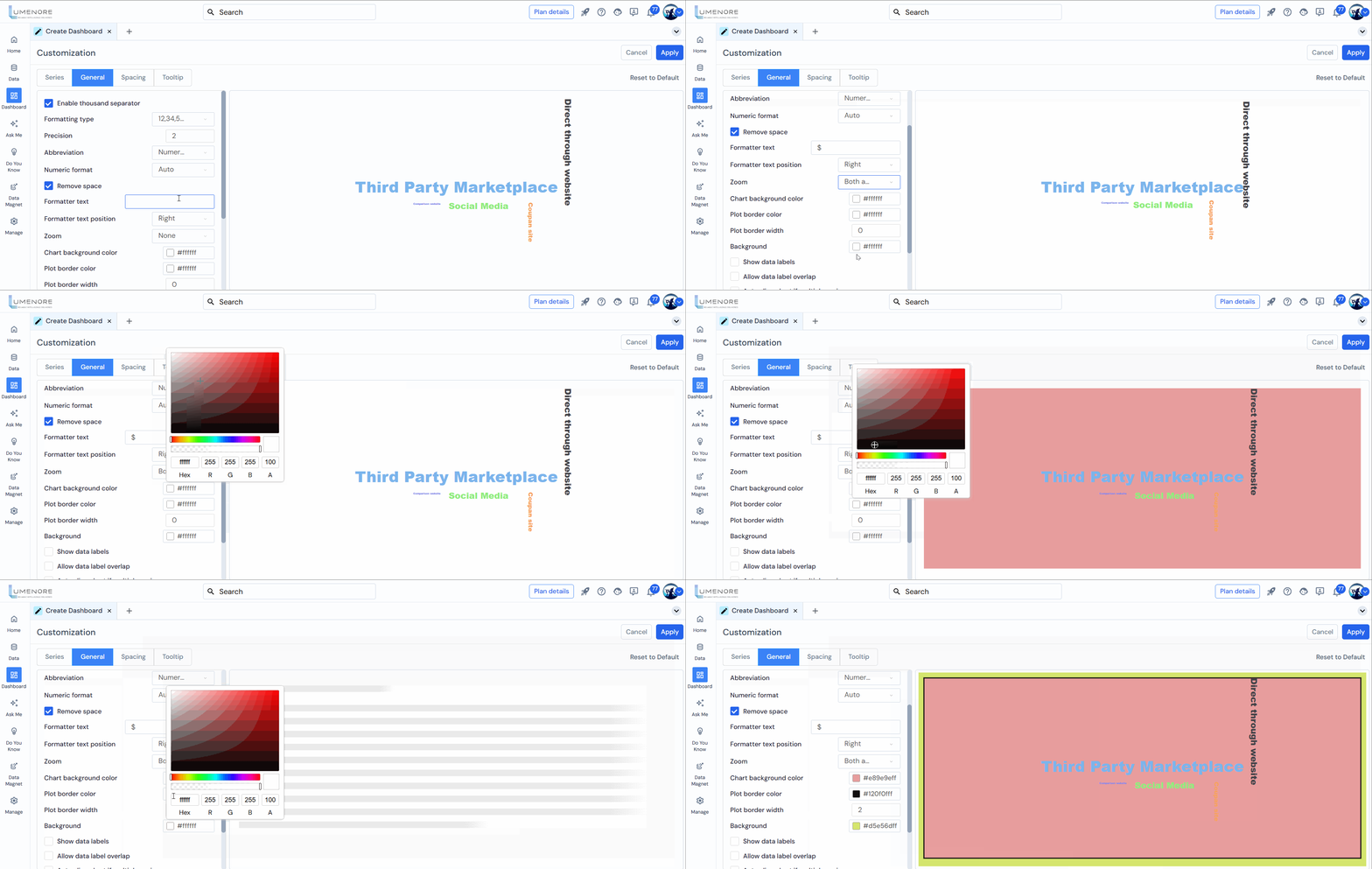
- Enable Thousand Separator: This will add a thousand separator to the value shown in the chart. For example, if the value is 285082, it will be shown as 285 082 after applying a thousand separator.
- Precision: Add the values shown after the decimal. For example, if the user enters 2,” the value will be shown as 7564.26″; if entered 3,” the value will be 7564.261.”
- Abbreviation: The user can add an abbreviation to the value shown in the chart. Options available are none, numeric, time format, and logarithmic.
- Numeric format: Refers to how numbers are displayed on a chart. Options include none, auto, thousands, millions, and billions. Users can choose the appropriate data points format based on their needs.
- Remove Space: Removes any spaces between numbers and units/abbreviations (e.g., shows 100K instead of 100 K).

- Formatter Text: To add the format text with the value. For example, the user can enter “$” in the formatted text box if the value is in dollars.
- Formatter Text Position: The user has two options to position the formatted text: Right and Left. For example, if the value is 285,082K and the user selects “Right,” the output will be shown as 285,082K$. If “Left” is selected, the output will be $285,082K
- Zoom: The user can zoom into the chart from different angles for a clearer view. First, the user needs to select the zoom option and then drag the part of the chart that the user wants to zoom; the options are:
- Horizontal zoom: It will zoom horizontally to the part of the chart the user wants to zoom in by dragging it.
- Vertical zoom: It will vertically zoom to the part of the chart that the user wants to see by dragging it.
- Zoom for both axes: It will zoom to the part of the chart the user wants to zoom in by dragging it.
- Chart Background Color: The user can change the chart’s background color according to their needs.
- Plot Border Color: The color used for the border or outline of the plotting area in a chart. This border can help delineate the area where data points, bars, lines, or other visual elements are displayed, making the chart easier to read and visually appealing.
- Plot Border Width: Refers to the thickness or width of the border or outline around the plotting area in a chart. A thicker border can make the plotting area stand out more prominently, while a thinner border can provide a more subtle delineation.
- Background: Here, the user can set the background color.
- The user can enable the following:
- Show data labels: This shows the labels on the top of the bar; the user can enable or disable it by checking or unchecking the box.
- Allow data label overlap: This setting controls whether data labels (names, values, or percentages) overlap on the chart or graph.
- Auto-align chart if multiple y-axis: This feature adjusts the chart’s alignment when multiple Y-axis are present. By adequately positioning and scaling the axes, this feature ensures that the chart remains clear and readable.
- Data Label Font Size: Refers to the text size used for data labels on a chart. It determines how large or small the text appears when displaying numerical values or labels directly on data points, bars, or other chart elements.
- Data Label Color: This setting refers to the color used for the text of data labels displayed on a chart. It allows users to customize the appearance of the labels that accompany data points, bars, or other elements in a chart.
- Hover Background Color: The user can change the point hover background color, which is visible when the user hovers on the chart.

Spacing
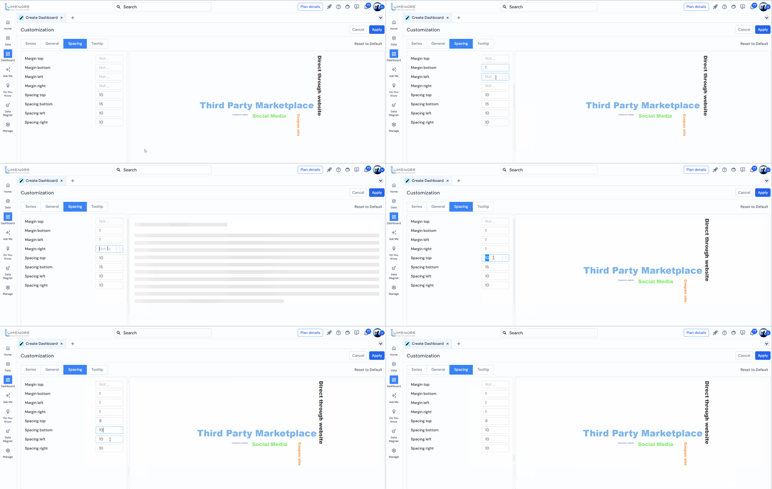
In Spacing, the user can customize the spacing of the chart. Users can customize the following options:
- Margin Top: The user can customize the margin of the chart from the top. It is set to 0 as the default; increasing the value will increase the margin from the top.
- Margin Bottom: The margin from the bottom can be customized by the user. It is also set to 0 by default; increasing the value will increase the margin from the bottom.
- Margin Left: The user can customize the margin of the chart from the left. It is set to 0 as the default; increasing the value will increase the margin from the left side of the chart.
- Margin Right: The user can customize the margin on the right. It is also set to 0 by default; increasing the value will increase the margin from the right side of the chart.
- Spacing Top: It defines the spacing of legends from the chart area. For example, if we increase the spacing from the top, the legend will be pushed downward.
- Spacing Bottom: It defines the spacing of legends from the chart area. For example, if we increase the spacing from the bottom, the legend will be pushed upward.
- Spacing Left: It defines the spacing of legends from the chart area. For example, if we increase the spacing from the left, the legend will be pushed more rightward.
- Spacing Right: It defines the spacing of legends from the chart area. For example, if we increase the spacing from the left, the legend will be pushed more leftward.
Tooltip
In Tooltip, the user can customize the tooltip properties of the chart. Users can customize the following options:
- Enabled: To enable the tooltip in the chart, the user must check this box. After that, the user can see the tooltip when they hover over the chart.
- Background Color: The user can change the tooltip background color.
- Font Color: Now, the user can change the font color used in the tooltip to match the background color.
- Border Radius: The user can also change the radius of the tooltip box to get the tooltip appearance as per feasibility.
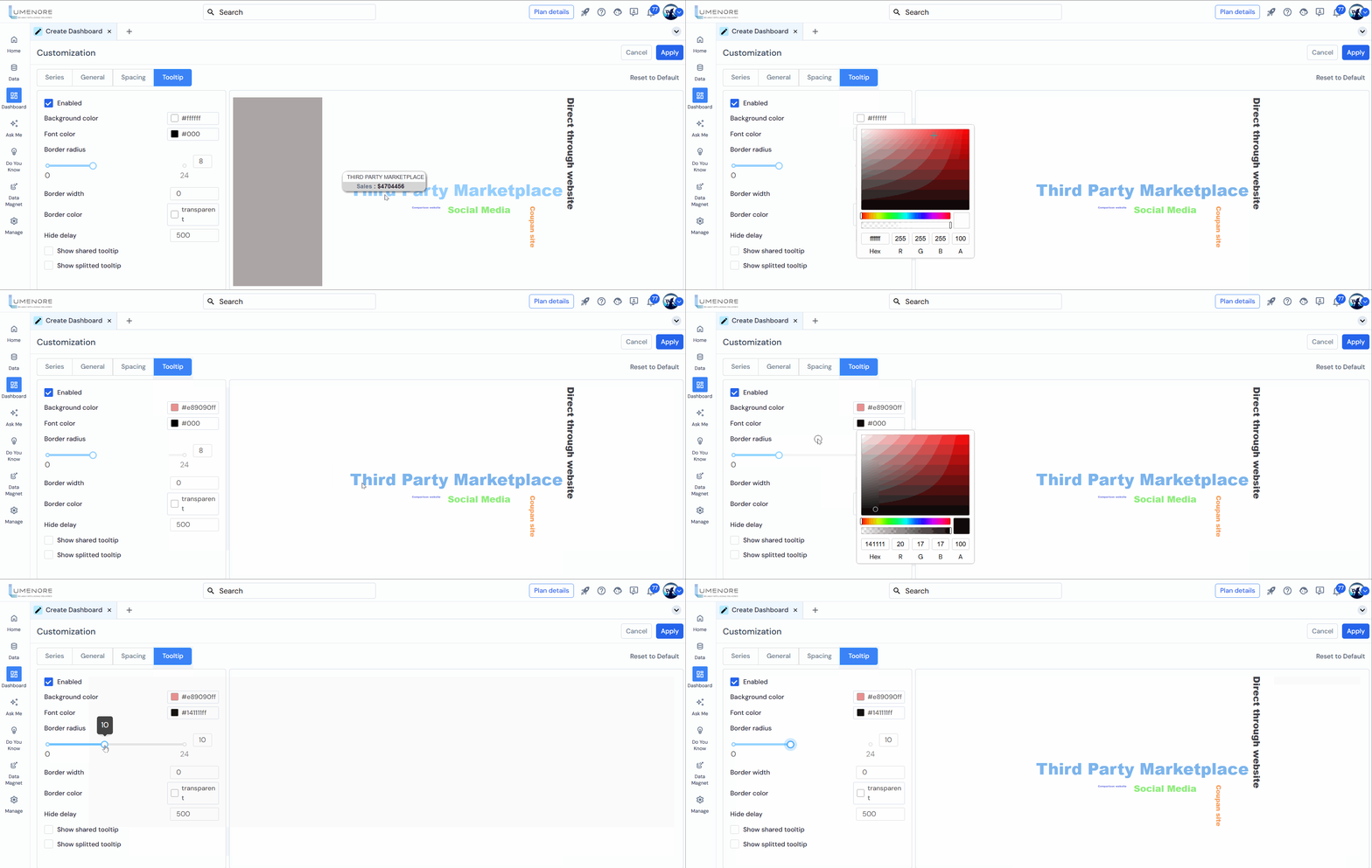
- Border Width: To change the border width of the tooltip, the user can increase the value, and the border width will increase accordingly.
- Border Color: The user can also change the border color of the tooltip.
- Hide Delay: This is to change the delay time of the tooltip disappearance. The user can increase it to increase the delay time more or decrease it to decrease the delay time of the tooltip in a chart after the user hovers above it.
- Show Shared Tooltip: This option is not applicable for vertical charts (1 measure or attribute); it is applicable for grouped bar charts.
- Show Splitted Tooltip: This option is not applicable for vertical bar charts (1 measure or attribute); it is applicable for grouped bar charts.

