Organization Management
The Organization Management section enables administrators to oversee organization-level settings and track user statistics within the platform. It provides a centralized hub for managing organizational configurations, monitoring user activity, and ensuring consistency across the platform.
It includes:
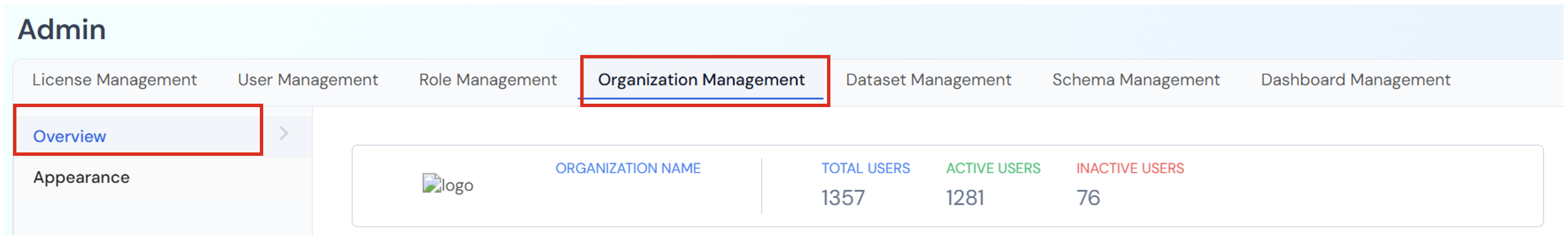
Overview Tab:
Displays key details about the organization, such as:
- Organization Name: The registered name of the organization.
- Total Users: The total number of users associated with the organization.
- Active Users: Number of users currently active on the platform.
- Inactive Users: Number of users who are not currently active.
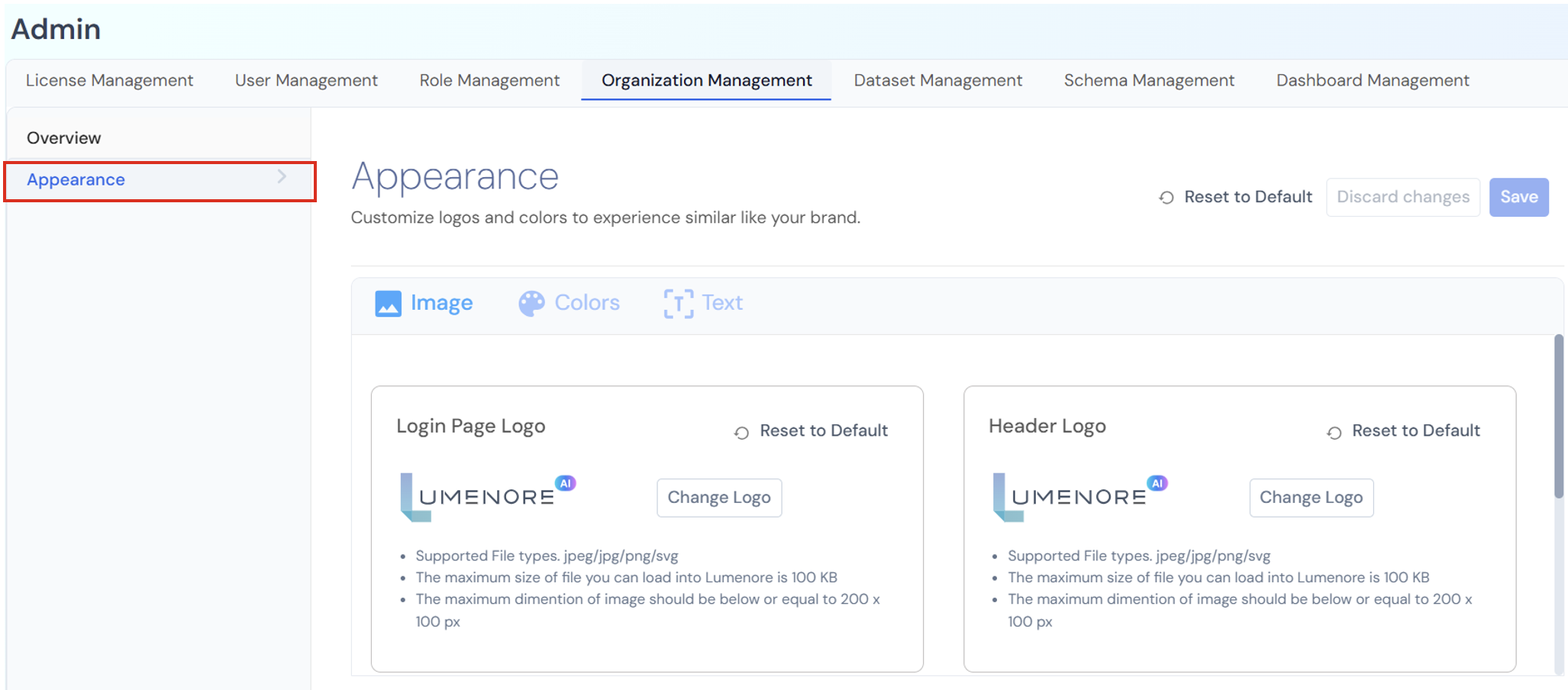
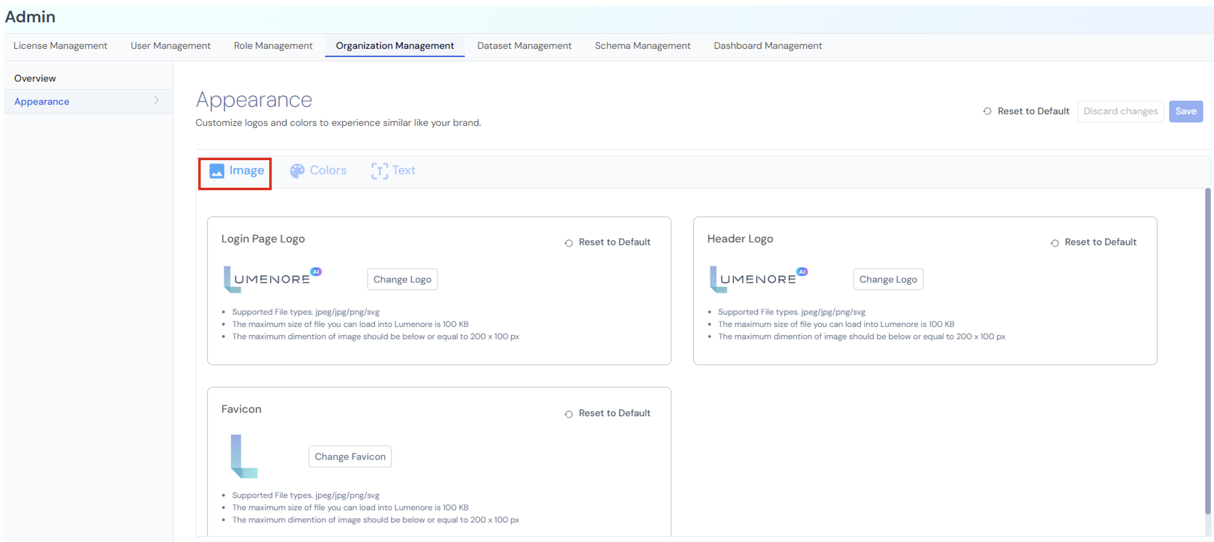
Appearance Tab:
The Appearance section within Organization Management enables administrators to tailor the platform’s visual branding to match their organization’s identity. It offers options to customize logos, colors, and text, ensuring a cohesive and branded user experience.
These settings empower organizations to control the look and feel of their Lumenore environment, maintaining brand consistency and enhancing user recognition.
Image
In this section, the user can upload and manage the organization’s branding images:
- Login Page Logo:
Customize the logo displayed on the login page.- Supported formats: .jpeg, .jpg, .png, .svg
- Maximum file size: 100 KB
- Recommended dimensions: 200 × 100 px
- Header Logo:
Upload the logo that appears in the application header (top navigation bar).- Follows the same file format and size rules as above.
- Favicon:
Set a small icon that appears in the browser tab.- Supported formats and limits are the same.
Each section also includes a Reset to Default option to revert changes.
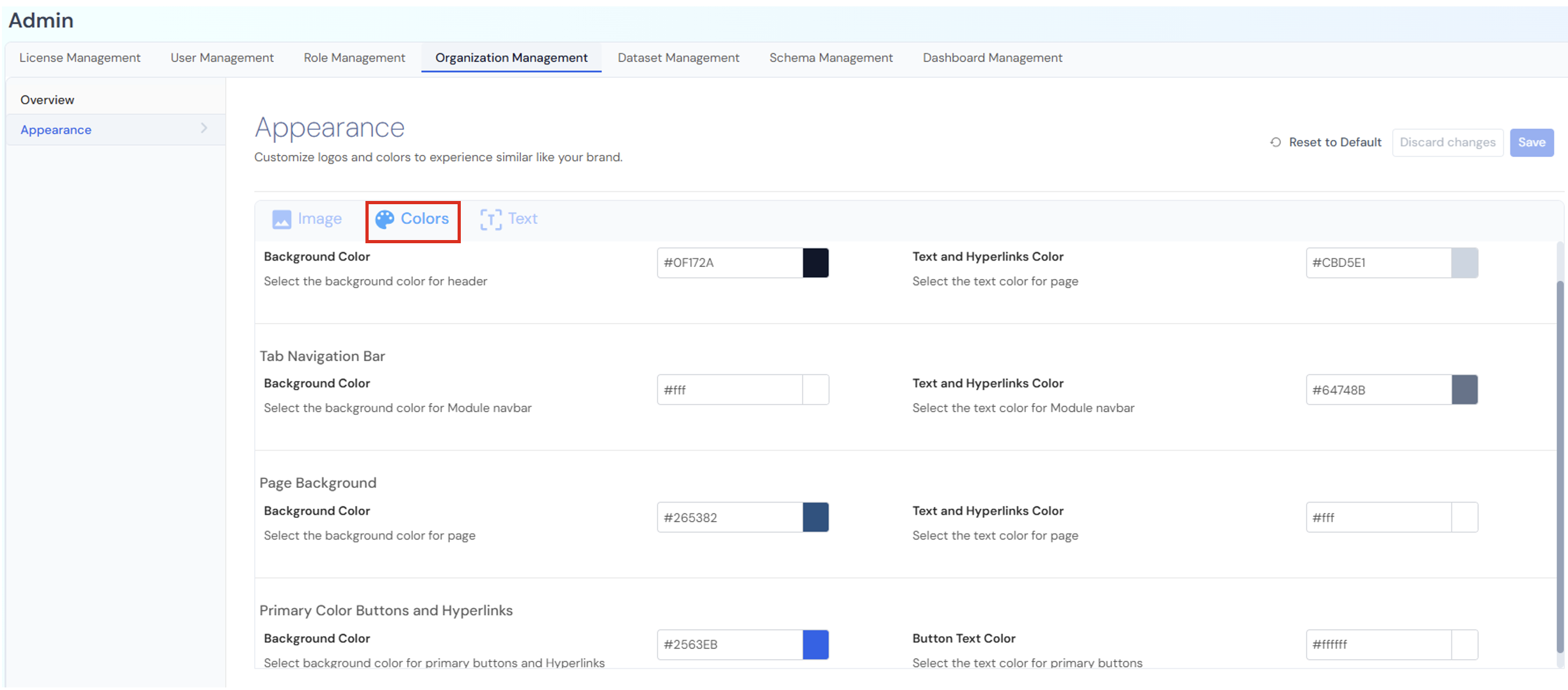
Colors
This section lets the user personalize the color scheme of different interface elements to match their brand colors:
- Header: Set the background color and text/hyperlink color for the header bar.
- Tab Navigation Bar: Customize the background and text color for the main navigation tabs.
- Page Background: Choose the background color for the overall page layout.
- Primary Color Buttons and Hyperlinks: Define the colors for key buttons and links (background and text).
Note: Each color can be selected by hex code, ensuring precise branding.
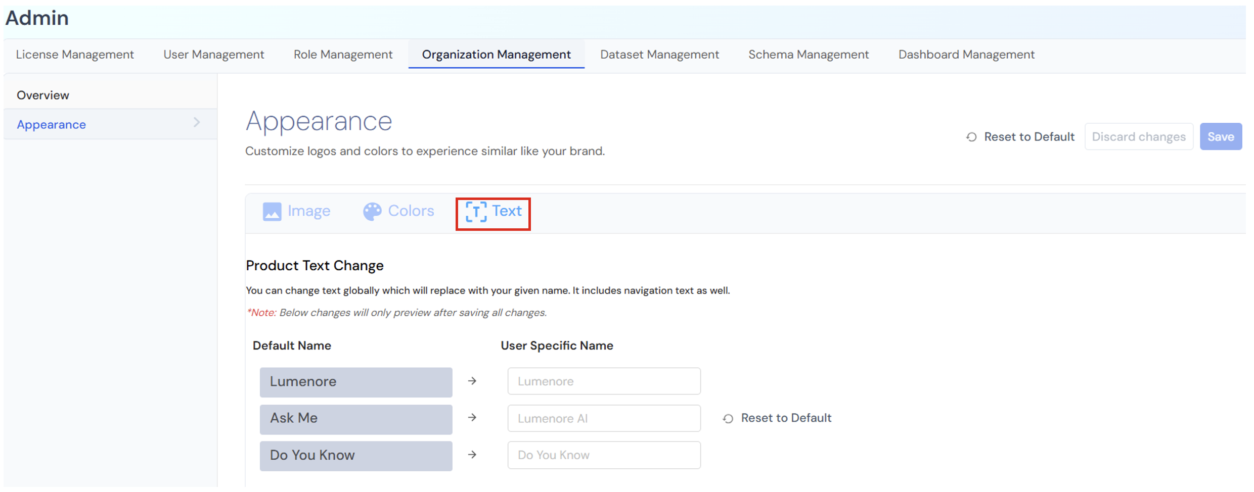
Text
Product Text Change: The user can change the default text labels used throughout the software (for menus, buttons, or features).
If the user changes a name here, it will update everywhere in the product interface, including the navigation bar, menus, and other references.
Note: The changes will only be previewed after all changes are saved.
Table Columns:
|
Column |
Meaning |
|
Default Name |
The original name used in the system. |
|
User Specific Name |
The user can customize the name. |
Action Buttons:
- Reset to Default: To restore all names to their original default values.
- Discard changes: To cancel any edits or modifications made.
- Save: To proceed with the changes made.