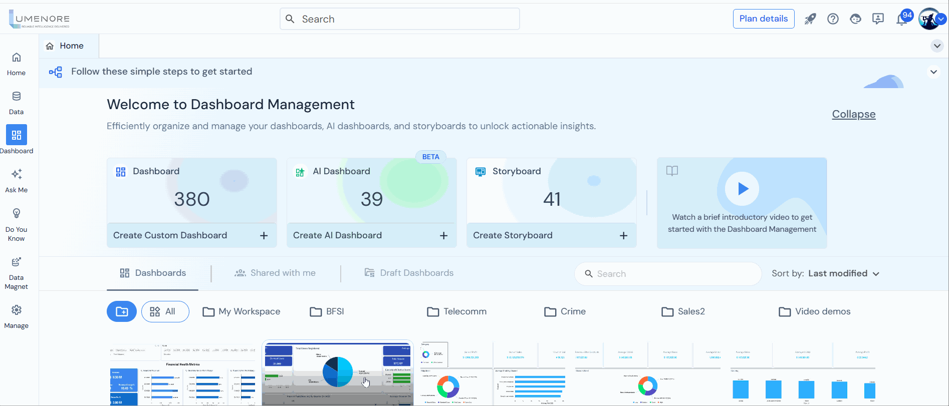
Creating dashboard
Dashboards can be customized to display metrics such as website traffic and sales figures weekly in a data analytics platform.
To create a dashboard in Lumenore follow below steps:
Step 1: Access “Create Dashboard” either from the homepage or the Dashboard page and choose “Create Dashboard”.
- From Home Page

- From Dashboard Page

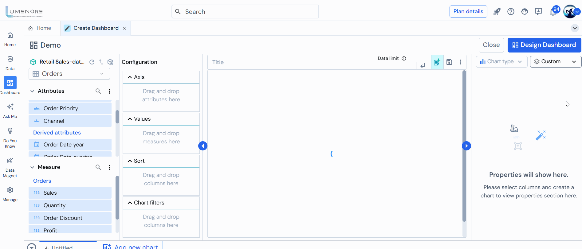
Step 2: Click on “Create Custom Dashboard,” enter the desired dashboard name, select the appropriate schema and table, then click “Ok.”
Step 3: The user can manage, change, and refresh the schema anytime by clicking on the icons at the top left to access schema manager.
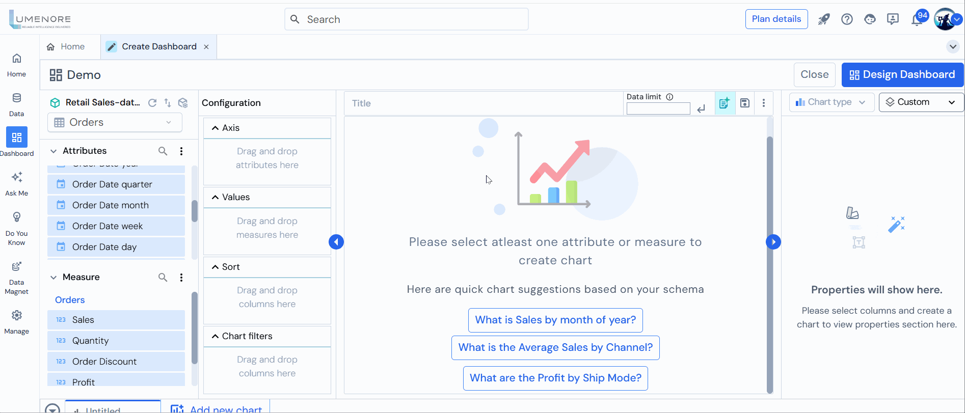
Step 4: Upon clicking the three dots adjacent to attributes, three options will be displayed:
- Calculate Attribute: To create a customized attribute according to the requirement.
- Add Hierarchy: To establish a column hierarchy for implementing drill-down functionality on charts. For example, a hierarchy of three columns-Country, State, and City.
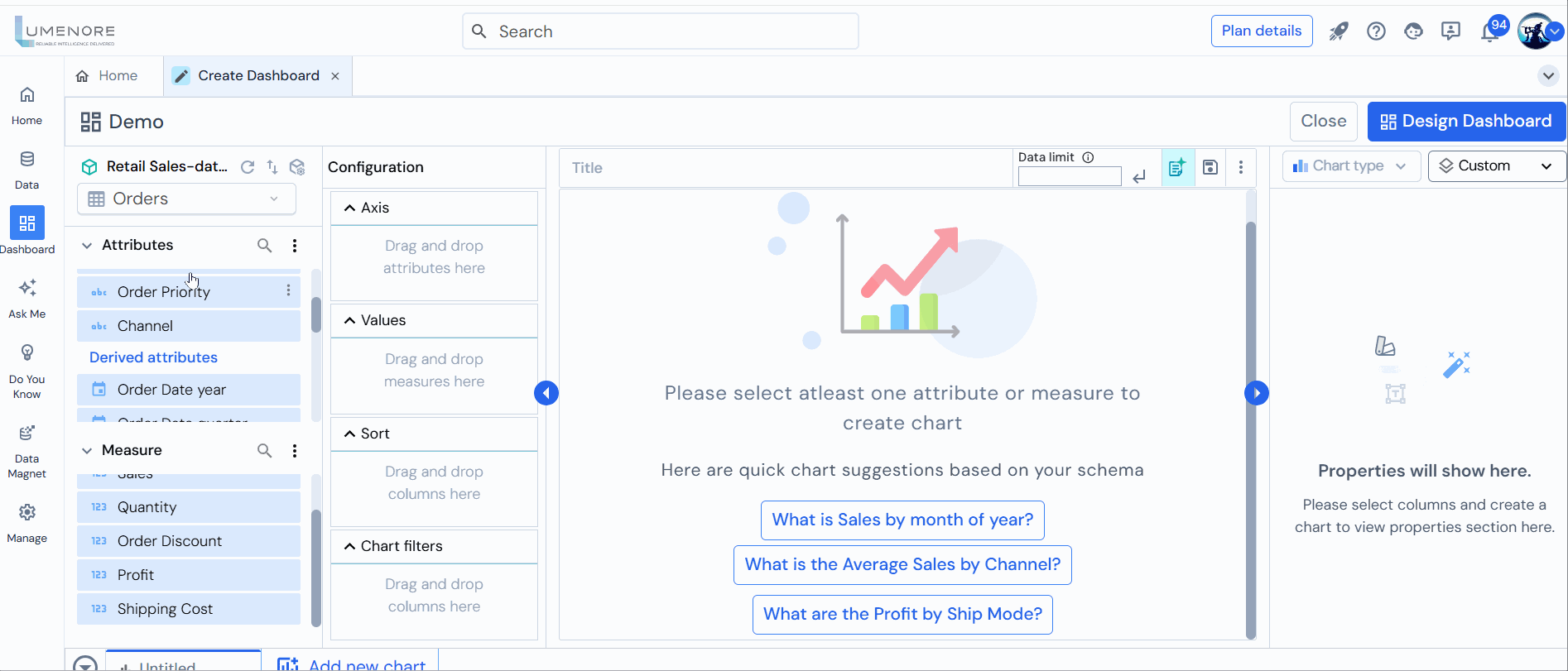
Upon clicking the three dots adjacent to measures, three options will be displayed:
- Calculate Attribute: To create a customized attribute according to the requirement.
- Create/manage what-if parameters: To explore the potential outcomes or consequences of changes in one or more input variables. It defines the relationship between two or more variables, where both dependent and independent variables may exist.
- Create Quick Measure: This feature allows users to define custom metrics in BI tools by selecting predefined measures and attributes without needing to write complex formulas.

Note:
- Attributes represent qualitative data and encompass text-based information. They serve the purpose of segmenting or categorizing data into specific groups or classes. For instance, an attribute named “department” could showcase various department names within a company.
- A measure represents quantitative and measurable data, often associated with numerical values or metrics that can be analyzed or computed. It helps quantify specific aspects of business performance or characteristics. For example, performance metrics like sales figures, profits, discounts, shipping costs, and other numeric data points are typical measures used for analysis and evaluation within a business context. In contrast to attributes, measures usually involve numerical values that can be aggregated, averaged, or subjected to various mathematical operations for analytical purposes. They provide crucial quantitative insights into a given dataset’s performance or characteristics.
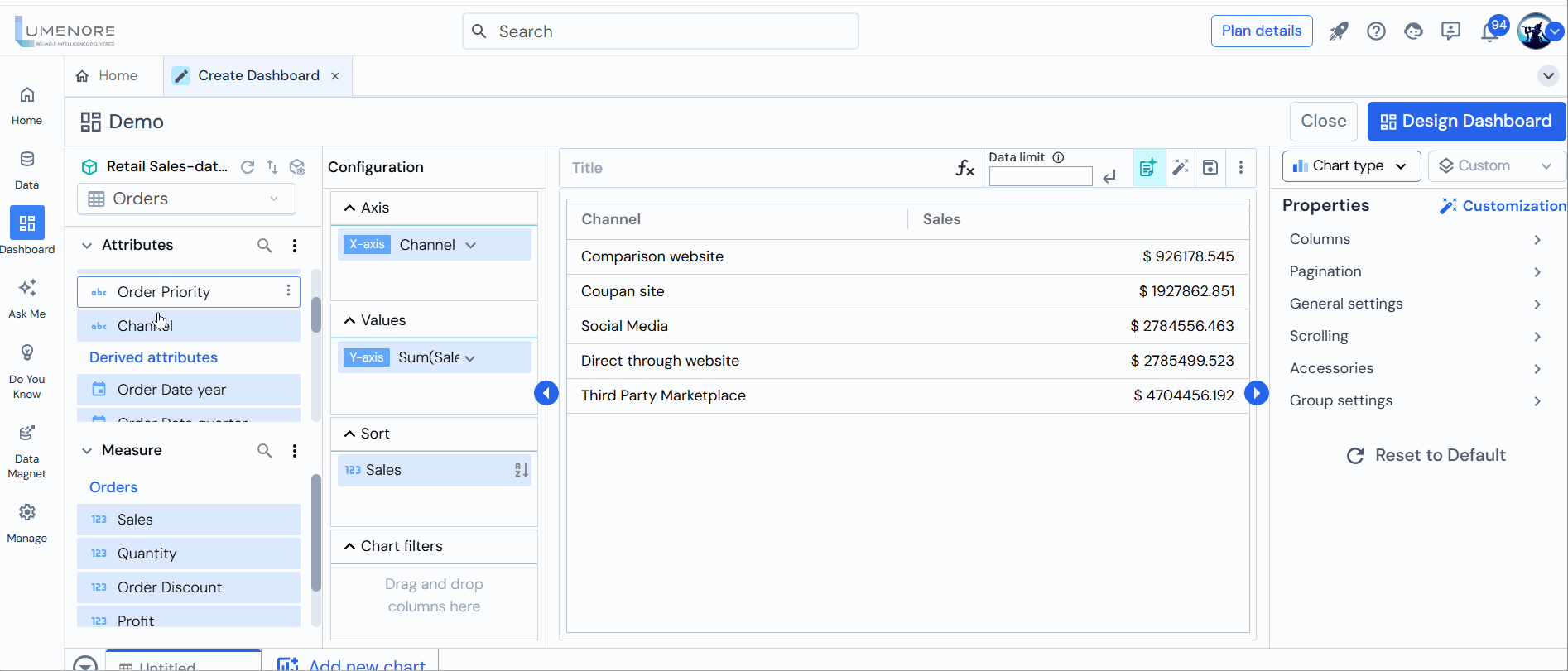
Step 5: Choose at least one measure and attribute, and a table view will be displayed.
Step 6: Users can sort attributes and measures in ascending and descending orders.
- Attributes are arranged alphabetically, either in ascending or descending order. To sort them, choose your preferred option and click “Apply.”
- Initially, users need to select the type of aggregation based on their requirements, like sum, count, average, and more.
Once the aggregation type is selected, choose between ascending or descending sorting, then click “Apply.”
Step 7: Users can apply chart filters to both attributes and measures.
- When applying chart filters to attributes, select the appropriate conditions below based on the specific requirement:
- In
- Not in
- Top/Bottom N
For the “In” condition, choose the elements you wish to incorporate in the chart. Conversely, for the “Not In” condition, select the elements you prefer not to display on the chart.
Click “Save” after making the selections.
In the Top/Bottom N condition, determine the display type, specify the number of items, and select the value based on which you want to apply the condition.
Then click “Save.”

Note: The Top/Bottom N filter can only be applied to the attributes or measures utilized in the chart.
- When applying chart filters to measures, select the appropriate conditions mentioned below based on the specific requirement:
- Equal
- Not Equal
- Less than
- Greater than
Once you’ve chosen the condition, specify the value and the type of aggregation based on your requirements.
Then Click “Save” to proceed. 
Step 8: Navigate to “Chart Type” and choose the appropriate chart based on your needs.

Note: To customize the chart setting, click “Customization”.
Step 9: Navigate to the dashboard creation screen and click “Custom” to modify the chart layout.
Instead of default settings, a custom chart allows you to tailor the visual representation of data according to your needs. This can include adjusting colors, labels, axes, and other elements to communicate better the information you want to convey.
Upon selecting the “Custom” option, you will encounter a range of template choices. Click on any of the available templates. As an illustration, let’s choose template 4 for demonstration purposes.
Next, tap the “+” icon to include the following options:
- Charts
- Micro Chart
- Text/Widget
- Grid
- Image
Step 10: Once you have generated multiple charts, click “Next” in the bottom right corner to create the dashboard.
Step 11: Select the dashboard layout according to your requirements. Then click Apply.
Step 12: Once the dashboard is created, you gain access to various functionalities to interact with your dashboard, such as canceling, filtering, customisation, publishing, modifying layout, including a header, adding text, and inserting cards.

