Chart property: Table chart
A table is a visual component that displays data in a tabular format. It is a fundamental element used to present and analyze data in a structured manner. Here’s how tables are typically used in BI tools:
- Data Display: Tables display raw data or aggregated data from various data sources. They present the data in a structured format, with rows representing individual records and columns representing different attributes or measures.
- Data Exploration: Tables allow users to explore and analyze data by sorting, filtering, and grouping the data based on specific criteria. Users can drill down into the data to view more detailed information or perform calculations within the table.
- Data Visualization: Tables can be combined with other visual components like charts or graphs to provide a comprehensive data view. They can also act as a supporting element to provide detailed information or as a reference for the visualizations.
- Interactivity: Tables often provide interactive features such as column sorting, filtering, and highlighting. Users can interact with the table to dynamically change the data view and focus on specific subsets of data.
Here are some of the best usages of tables:
- Data Comparison: Tables effectively compare data across different categories or dimensions. By arranging data in columns, you can easily compare values. This is particularly useful when comparing performance metrics, product features, pricing plans, or other data points that must be compared systematically.
- Data Filtering and Sorting: Tables can be interactive, allowing users to filter and sort data based on specific criteria. This functionality enables users to explore and analyze data dynamically. For example, users can filter a table to display specific regions, dates, or product categories or sort the table based on ascending or descending order.
- Comparison and Decision-Making: Tables are valuable for comparing and facilitating decision-making processes. They can present multiple options, criteria, or variables in a structured format, allowing stakeholders to assess and compare alternatives. Tables can be used for cost-benefit analysis, feature comparisons, project evaluations, and more.
Advance Properties of Table Chart:
To customize the table’s advanced properties, click “Customisation”

Columns
In Columns, the user can customize the properties of the selected series.
Users can customize the following options:
- Select the attribute type from the drop-down menu.
- Name: This property allows the user to change a column’s name manually. By editing the column name, users can customize it to reflect better the information or context it represents.
- Enable Bar: This option allows the user to activate a bar feature in the table. When enabled, this option often provides additional customization settings for choosing the color for positive and negative values.
- Background Color: This property allows the user to modify the background color of a selected column. Users can choose any desired color to customize the column’s appearance.
- Border Width: This property allows users to adjust the border width for a selected column. Users can customize the column’s visual representation by increasing or decreasing the border width. In the image below, the border width of the column is set to 2. Users can adjust this value as needed to achieve the desired visual effect or to differentiate the column from others in the table.
- Border Style: This property allows users to customize the border style for the rows of a selected column. Four options are available: solid, dotted, none, and dashed solid.
- None:Selecting this option removes the border from the columns rows, resulting in no visible border.
- Solid: This option applies a solid line border style to the columns rows.
- Dotted: This option applies a line border style to the columns rows.
- Dashed Solid: This option applies a solid line border style to the columns rows, with dashes along the line at regular intervals.
Users can select the appropriate border style that best suits their design requirements and enhances the column’s visual representation.
- Border Color: Besides the border style, users can customize the border color for the rows of a selected column. This property allows users to choose a color that aligns with their design preferences or enhances the columns visual appearance.
- Font Color: This property allows users to modify the font color of a selected column. In the below image, users can customize the appearance of the columns text by selecting a specific color, such as black. This allows for better visual contrast or alignment with the overall design.
- Font Size: This property enables users to adjust the font size of the text within a selected column. The font size can be increased or decreased based on feasibility and the desired visual impact.
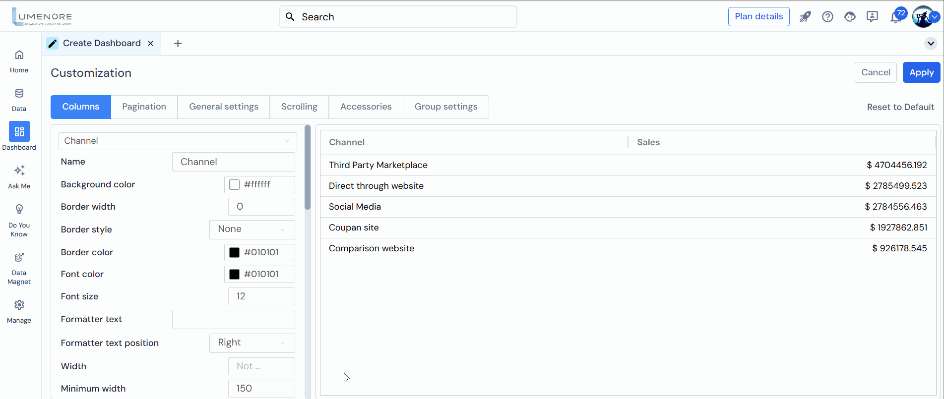
- Formatter Text: This property allows users to add formatted text to the values within a selected column.
- Formatter Text Position: The formatted text position property enables users to control the placement of the formatted text, enhancing the visual representation and context of the data within the table. This property allows users to position the formatter text within a selected column.
Users have two options: Right and Left. For instance, if the value in the column is 285,082K and the user selects Right as the formatter text position, the output will be displayed as 285,082K$, with the symbol ($) placed at the right side of the value. - Width: The width property allows users to specify the width of the selected column in the table. By adjusting the value, users can increase or decrease the width of the column accordingly. Increasing the width value will expand the column, allowing more content to be displayed. Conversely, decreasing the width value will narrow the column, potentially truncating or wrapping the content to fit within the available space.
- Minimum Width:The user can set the minimum width of the column, which means the column’s width will not be minimized more than the minimum width set.
- Maximum Width: The user can set the maximum width of the column, which means the columns width will not be maximized more than the maximum width set.

- Cell Wrap Text: Allows the content of a cell to be displayed on multiple lines within the same cell.
- Header Wrap Text: This option allows the text in the header cells to wrap onto multiple lines within the same cell.
- Enable Row Tooltip: This option allows users to see additional information about a row when they hover over it with their cursor.
- Enable Row Spanning: This feature enables the automated merging of cells for a particular series in the table. When enabled, cells belonging to the same series in consecutive rows can be merged, creating a visually consolidated representation. This eliminates redundant information and improves the overall clarity and compactness of the table.
For example, if there are multiple rows with the same series name, enabling row spanning will merge those cells into a single cell that spans across multiple rows. This consolidation reduces duplication and provides a more streamlined view of the data. - Row Span Item Corresponding: This functionality allows the merging of cells based on specific criteria such as country and segment. For example, if there are multiple rows with the same country and segment values, enabling row spanning with the corresponding criteria will merge those cells into a single cell that spans across the relevant rows. This grouping of data enhances readability and simplifies the interpretation of the table.
- Row Span Item Alignment: This feature allows users to specify the alignment of the merged cells in the table. When cells are merged due to row spanning, it is important to define how the content within the merged cells should be aligned. Users can choose from various alignment options: top, middle, or bottom. These options determine the vertical positioning of the content within the merged cells.
- Transform Row Data to Columns: This feature allows users to transform the row data of a selected series into columns. When working with tabular data, there are scenarios where it may be beneficial to restructure the data to present it in a more columnar format. By enabling the transform row data to columns option, the values in the rows of a selected series are transposed into separate columns. For example, suppose there is a series with multiple rows representing different months. In that case, enabling this feature will transform the data so that each month becomes a separate column with its corresponding values.

- Configure Transformed Columns: This feature allows users to configure the transformed columns resulting from the row-to-column transformation. When data is transformed from rows to columns, there may be instances where data exists between the transformed columns and rows. The configure transformed columns option lets users define how this intermediate data should be treated.
(Add Condition window)
-
- Select View Type: As custom text or as the mapping column value.
- Text for found data: What should be displayed in the selected columns row if the data is found?
- Text for not found data: What should be displayed if the data is not found in the selected columns row?

- Enable Filter: This feature allows you to enable a filter option in the column header section of your table. When you enable the filter, it adds a filtering functionality to the column header, allowing users to filter and sort the data in that specific column easily. This can be useful when you have a large dataset and want to quickly search for specific values or apply sorting based on certain criteria.
- Hide Column: This option allows you to hide the selected column in your table. When you choose to hide a column, it becomes invisible and is not displayed in the table view. This can be useful when you have certain columns that are not relevant or necessary for the current data analysis or presentation. By hiding a column, you can declutter the table and focus on the important information without the distraction of unnecessary data.
- Pin Column: This feature lets you pin a column in your table, keeping it fixed while scrolling horizontally. Pinning a column ensures that important information or key identifiers remain visible to users, even when they scroll horizontally through a large dataset. The user can pin the column in the table on the right or left side.
- Lock Pinning: This feature disables the pin feature, and the pinned rows or columns stay stationary at the top or side of the grid, making it easier to compare data or maintain context.
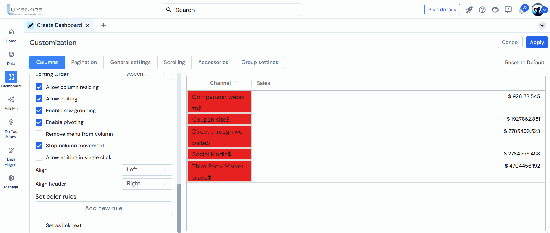
- Allow Sorting: This functionality lets users sort the data in a column in ascending or descending order. Users can easily organize and arrange the data based on their preferences or specific criteria by allowing sorting in a column. Users need to click on the column header to use this feature. Clicking once will sort the data in ascending order, while clicking again will sort it in descending order.
- Sorting Order: The user can sort the column in ascending or descending order by selecting the option. There are three options: ascending, descending, and none.
- Allow Column Resizing: This option allows users to manually resize columns in the table by enabling or disabling the column resizing feature. When enabled, users can adjust the width of the columns by clicking and dragging the column headers edge. This flexibility allows users to customize the table layout according to their preferences or accommodate varying content lengths in different columns.
- Allow Editing: Enables users to modify the content within a file or field. When this feature is activated, users can add, delete, or change text, numbers, and other data elements.
- Enable Row Grouping: This functionality allows users to group rows based on a specific column or criteria, providing a structured and organized data view. Users can group related rows by enabling row grouping and creating logical subsets within the table. This can be useful for organizing and summarizing data based on common attributes or categories. For example, suppose you have a table of sales data. In that case, enabling row grouping on the “Region” column can group all rows with the same region together, providing a concise overview of sales performance by region.
- Enable Pivoting: This feature allows users to transform the tables structure by pivoting the data based on selected columns. Enabling pivoting allows users to reorganize the rows and columns of the table to create a summarized and cross-tabulated view of the data. It also allows users to dynamically switch the tables orientation dynamically, making analyzing data from different perspectives easier.
- Remove Menu from Column: This feature allows users to remove the menu option typically displayed in the column header. The menu, often represented by three lines or a vertical ellipsis, provides additional options and functionality for interacting with the column.
- Stop Column Movement: This functionality allows users to lock a selected column in its default position within a table. Once the “Stop Column Movement” option is enabled, the specific column will become fixed and cannot be moved horizontally. However, users can still rearrange other columns in the table.
- Allow Editing in Single Click: Enables users to enter edit mode for a cell or field with just a single click. This feature streamlines the editing process by eliminating the need for additional steps, such as double-clicking or selecting an “Edit” option.
- Align: This property allows users to adjust the alignment of the content within the selected column. Users can control how the data within the column is visually positioned by choosing an alignment option. There are three alignment options for columns: right, left, and center.
- Align Header: Adjust the alignment of the text within header cells.

- Set Color Rules (Add New Rule): This applies conditional formatting to the grid or chart, where the user can set different colors according to the rule/conditions set. Details of the same are given below:
Conditional formatting in Grid
Conditional formatting in a grid is a feature that allows you to automatically apply formatting to cells in a grid based on specific conditions. This is useful for highlighting important data and making it easier to understand.
For example, you could apply conditional formatting to cells in a column so that any cell with a value greater than 100 is highlighted in green, any cell with a value between 50 and 100 is highlighted in yellow, and any cell with a value less than 50 is highlighted in red.
Conditional formatting is used to visually emphasize data based on certain conditions. Users can do the following functions:
- Highlighting cells with specific values: To draw attention to certain data, the user can highlight cells based on a specific value or a range of values.
- Comparing data: The user can compare values between cells and highlight the cells that meet certain conditions, such as cells with higher or lower values than the average.
- Visualizing data: Conditional formatting can create visual representations of data, such as a heat map or a color scale.
To use conditional formatting in the grid:�
Step 1: Click “Add New Rule.”
Step 2: Select Table Column: When creating the chart, the user needs to select the column corresponding to the measure selected.
Step 3: Select Condition: Select the Condition, as required, for applying the same in the selected rows. The user can choose between the given conditions-
- is equal to
- is less than
- is less than equal to
- is greater than
- is greater than equal to
- is not equal to, is between.
Step 4: Select Condition Type: This property allows users to define the condition type for applying specific rules or comparisons to the values in a column. By choosing the appropriate condition type, users can compare other values within the same column, previous values, or other measures from the table.
There are three condition types available for selection:
- Value: Selecting the Value condition type enables users to compare the values in the column to a specific numeric or textual value. Users can define conditions such as equal to, not equal to, greater than, less than, etc., and specify the value for comparison.
- Compare to Previous: Choosing the compared to Previous condition type allows users to compare the values in the column to the previous value in the same column. This enables users to identify trends, changes, or variances between consecutive values within the column.
- Other Measures from Table: The Other Measures from Table condition type enables users to compare the values in the column to other measures or metrics available in the table. Users can select a different measure from the table and define conditions based on the relationship or comparison between the selected column and the chosen measure.
Step 5: Select Condition Type:The user will select the condition here. The option available is “As value.”
Step 6: Value: The user must set the value to apply the condition. It can be of any value as per the user.
Step 7: Set Fill Style:Users can customize the color of the bar or grid fill. For example, if I want to display values above 10000 in green and those below 5000 in red, I can select a color for each condition in every table column.
Step 8: Convert to Gradient:The user can change the color to a gradient, which flows from one color to another.
Step 9: Add Median Color:The user can also add a median color between the two points, i.e., the high and low values. So, it will be low-median-high.
Step 10: In the ‘Set Icon Style’ section, users can add and customize icons to enhance the visual representation of data in the column. This section includes several options for configuring the icons:
- Icon Design: Users can select the desired design or style for the icons. Various options may be available, such as simple shapes, predefined symbols, or custom-designed icons. The choice of icon design depends on the context and the message the user wants to convey.
- Icon Position: This property allows users to specify the icons position within the column. Common options include placing the icon at the beginning or end of the column or aligning it to a specific position within the columns data.
- Icon Alignment: Users can align the icon horizontally or vertically within its designated position. This property ensures that the icon appears visually consistent and well-aligned with the surrounding data.
- Icon Color: Users can customize the icons’ colors to match their preferred visual style or convey specific meanings. The color selection can be based on predefined palettes or customized to match the overall color scheme of the chart or visualization.
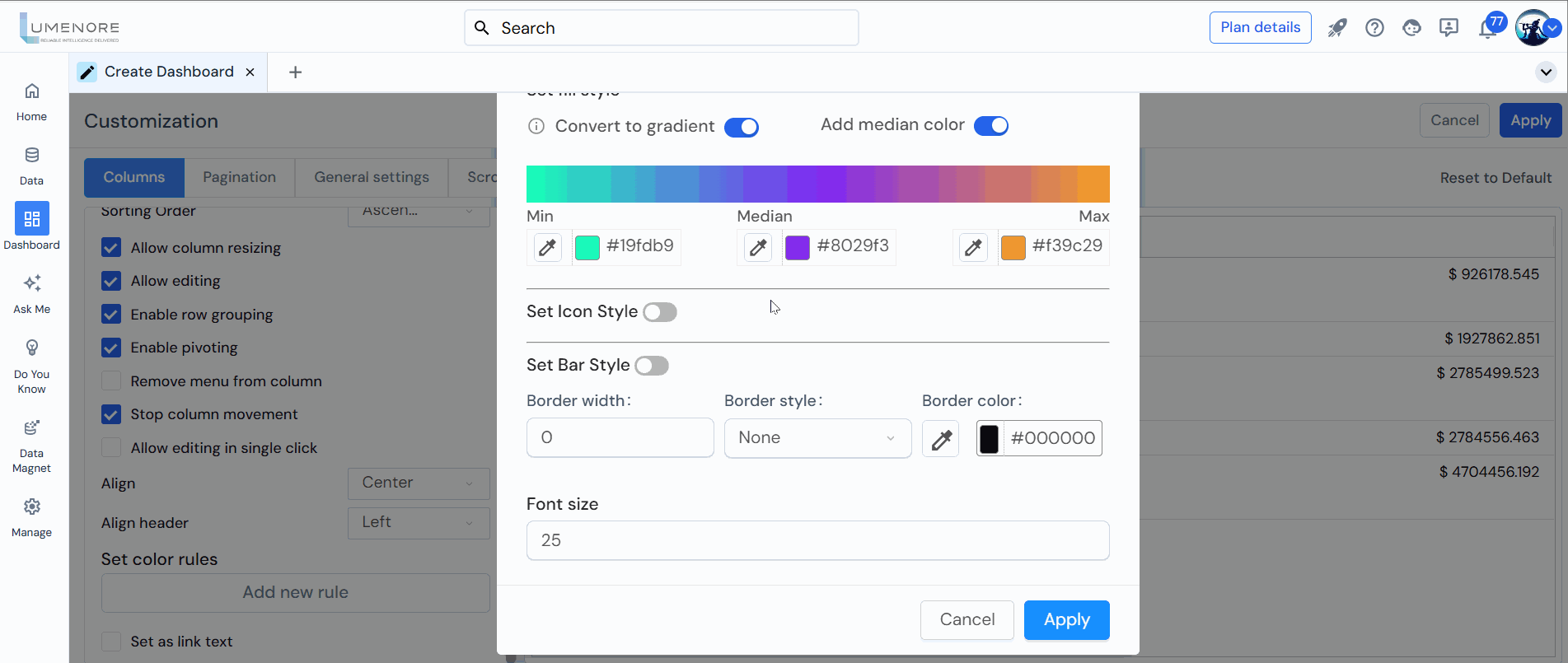
Step 11: Set Bar Style: This toggle enables the bar style feature. When turned on, the bars will be styled according to the settings.
- Convert to Gradient: The gradient option is enabled here, meaning the color of the bar will transition smoothly from one color to another. In this case, it goes from a teal color (#19fdb9) to a yellow-orange color (f39c29), indicating a range.
- Add Median Color: This toggle is off, which means no color is applied to the median value. If enabled, the median value of the range can be highlighted with a specific color.
- Min and Max Colors:
-
- The Min color represents the lower end of the data range.
- The Max color represents the upper end of the data range.
- Border Settings:
- Border width defines how thick or thin the border around a visual element (such as a bar, cell, or chart) will be.
- Border style defines the appearance of the border. Options often include solid, dashed, dotted, etc.
- Border color determines the color of the border. The color is typically chosen using either a color code (like hex, RGB, etc.) or a predefined color name.
- Font Size: This property enables users to adjust the font size of the text within a selected column. The font size can be increased or decreased based on feasibility and the desired visual impact.

Bars are displayed in the grid based on user-defined conditions, with gradient colors used to represent the data visually. For example, bars are color-coded from red (indicating lower values) to green (indicating higher values), allowing users to understand data distribution and identify trends or patterns quickly.
After applying all the conditional formatting in the row/grid, click “Apply.”
Step 12: Set as link text: This feature lets users convert selected text into a clickable hyperlink, directing them to a specified URL when clicked.
Pagination
In Pagination, the user can customize the page navigations and page view properties.
Users can customize the following options:
- Show Pagination: The Show Pagination feature divides a grid or table into multiple pages, allowing users to navigate through different data sets.
- Pagination organizes large datasets into manageable chunks, enhancing performance and user experience. It allows users to navigate easily through pages, which is especially useful for displaying extensive data.
- Auto Calculate Rows Per Page: When enabled, this feature automatically adjusts the number of rows per page in a paginated grid or table based on screen size and available space, optimizing the viewing experience without manual configuration.
- No. Rows Per Page: This feature allows users to customize the number of rows displayed per page in a paginated grid or table, providing flexibility to adjust the page size according to preferences or data viewing needs.

General Setting
In General Settings, the user can customize the general properties of the chart.
Users can customize the following options:
- Header Height: It refers to the vertical size of the column header in a table or grid. It can be adjusted to fit the content and ensure proper visibility and alignment of header text and elements.
- Header font size: controls the text size for headers, emphasizing their importance and creating a visual hierarchy. It can be customized in pixels (px), em, or rem.
- Header Theme: It refers to the visual style or color scheme applied to the column header in a table or grid. Users can choose from themes such as light, dark, or grey to enhance aesthetics and readability.
- Disable Multi-Sort: Enabling this option restricts multi-sorting, allowing users to sort data by only one column at a time, which is useful when prioritizing a single column for sorting.
- Replace Null with Zero: This feature replaces null or empty values in a dataset with 0, ensuring consistent calculations and preventing errors in aggregations or visualizations.
- Stop Auto-sizing of Columns: It prevents automatic resizing of columns in a table or grid. When enabled, the column width remains fixed, even if the content changes.

- Extra Space After Auto-Sizing Column: This refers to the extra space added after auto-sizing a column in a table or grid, allowing users to adjust the space for visual separation based on their preference.
- Skip Header On Auto-size: This property automatically shortens long header text to fit the column width after auto-sizing, ensuring the header maintains layout, readability, and visual appeal.
- Stop Columns Moving Animation: Enabling this option disables the animation when columns are moved, allowing them to snap instantly to their new positions for a static and immediate change.
- Stop Columns Movement: This feature locks the positions of columns in a table or grid, preventing them from being moved or rearranged, ensuring a consistent layout regardless of user interactions.
- Show Sort Icon: This property shows both upward and downward sorting arrows in a table column, even when no sorting is applied, providing a visual indication of the column’s sorting status.
- Always Show Menu in Column: This property ensures the menu icon is always displayed in the header of every column in a table, overriding individual column settings. When enabled, it makes the menu icon consistently visible, regardless of individual column configurations.

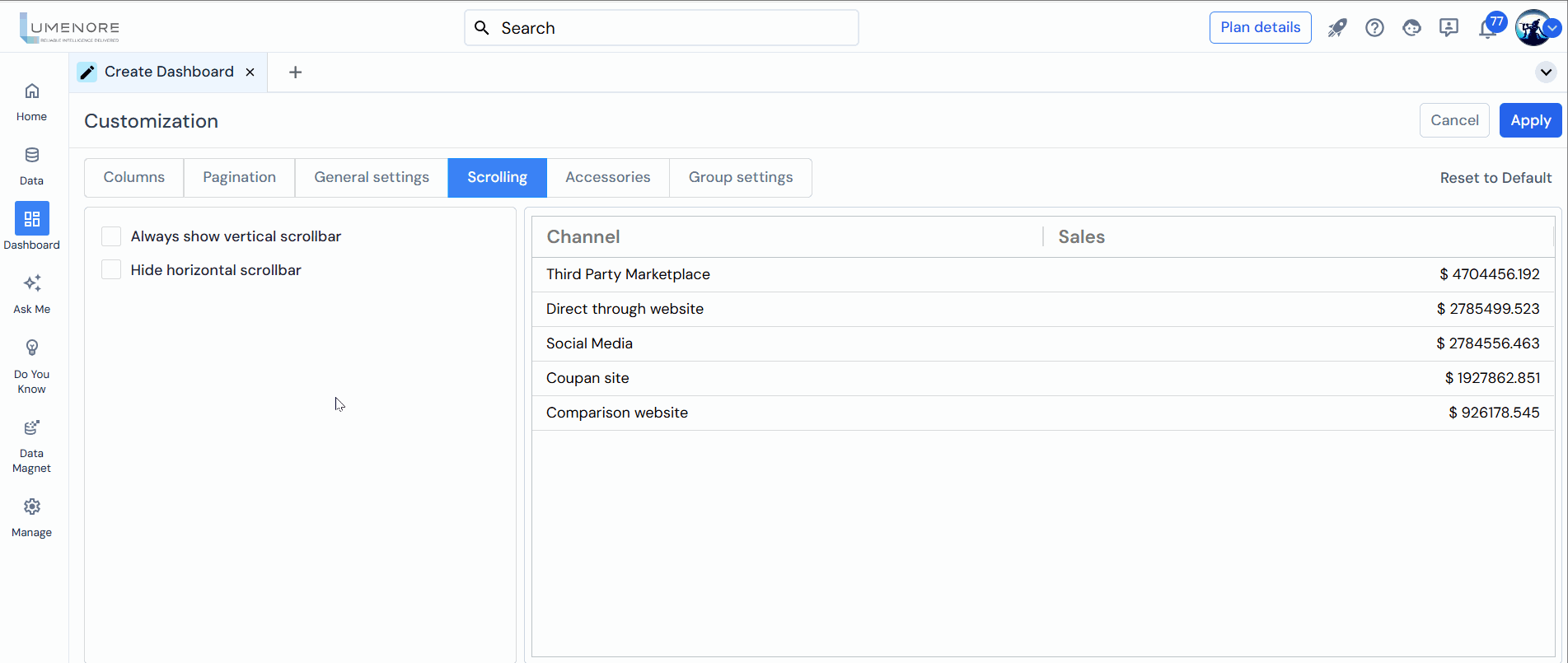
Scrolling
In Scrolling, the user can customize the scroll given in the chart.
Users can customize the following options:
- Always Show Vertical Scrollbar: Enabling Always Show Vertical Scrollbar keeps the scrollbar visible in a container, even when content doesn’t overflow. This ensures users are aware of the potential for additional content, regardless of whether they need to scroll.
- Hide Horizontal Scrollbar: Enabling Hide Horizontal Scrollbar removes the scrollbar, even when content exceeds the container’s width, providing a cleaner and more streamlined interface.
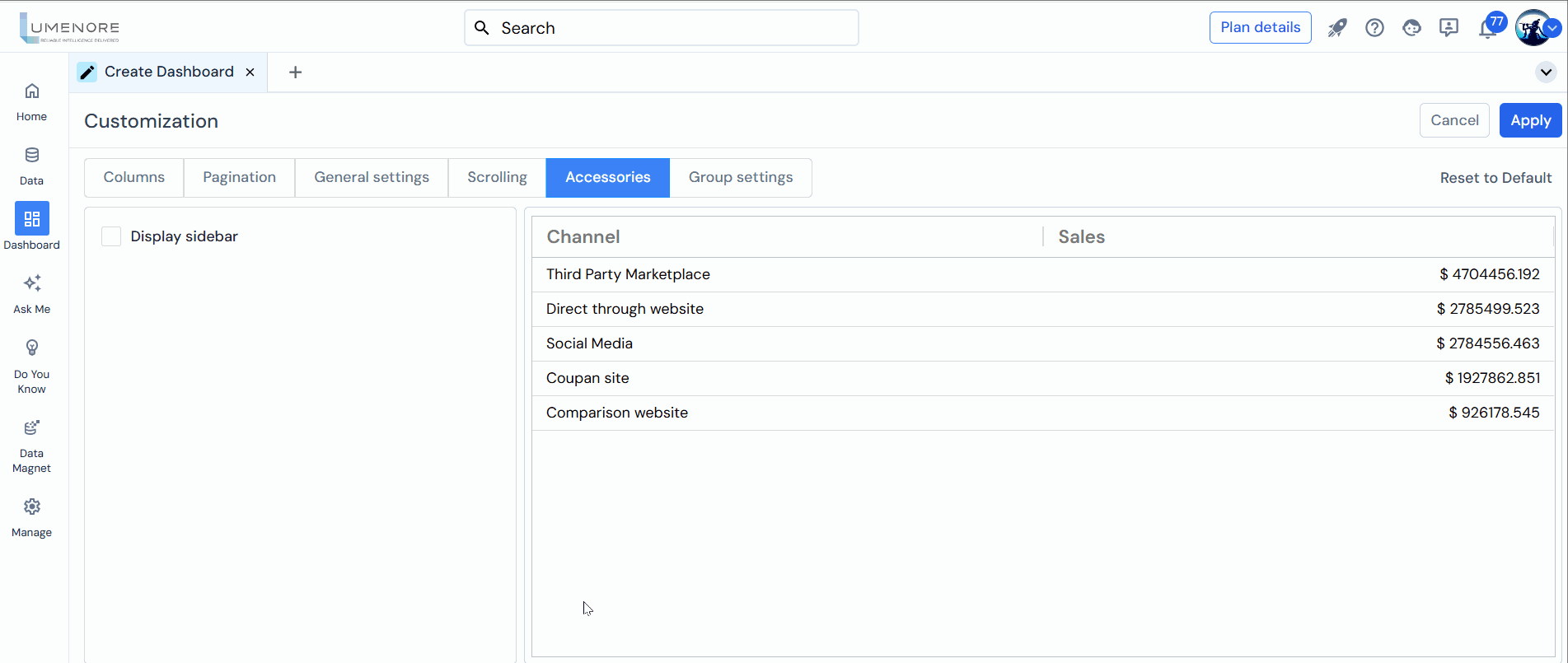
Accessories
In Accessories, the user can customize the display sidebar in the chart.
Users can customize the following options:
- Display Sidebar: This property allows users to customize the appearance and behavior of a table by enabling a sidebar. When this property is enabled, a sidebar is displayed alongside the table, providing additional customization options.
Within the sidebar, users can access and modify various settings related to the Columns of the table. These settings include:
- Pivot Mode: This option enables users to switch the table into a pivot mode, where they can perform operations such as pivoting rows and columns, aggregating data, and creating summary reports.
- Row Groups: Users can define row groups in the table, which allows them to group and categorize data based on specific criteria. This helps in organizing and visualizing the data in a structured manner.
- Values: Users can select the columns or data fields they want to include as values in the table. These values represent the numeric or aggregated data that will be displayed and analyzed.
By providing these customization options in the sidebar, users have more flexibility and control over the presentation and analysis of the data in the table. They can adjust the tables layout, grouping, and data aggregation to suit their needs and preferences.
In the sidebars Filters section, users can apply filters to specific columns based on the values present in those columns. This allows users to selectively display or hide data in the table based on their filtering criteria.
- For example, if the table has columns named Sales and Profit as measures, users can apply filters to these columns. They can specify conditions such as greater than, less than, equal to, or a range of values to filter the data accordingly.
- By applying filters, users can focus on specific subsets of data that meet certain criteria or exclude data that is not relevant to their analysis. This helps them drill down into the data and gain insights based on specific conditions or requirements.
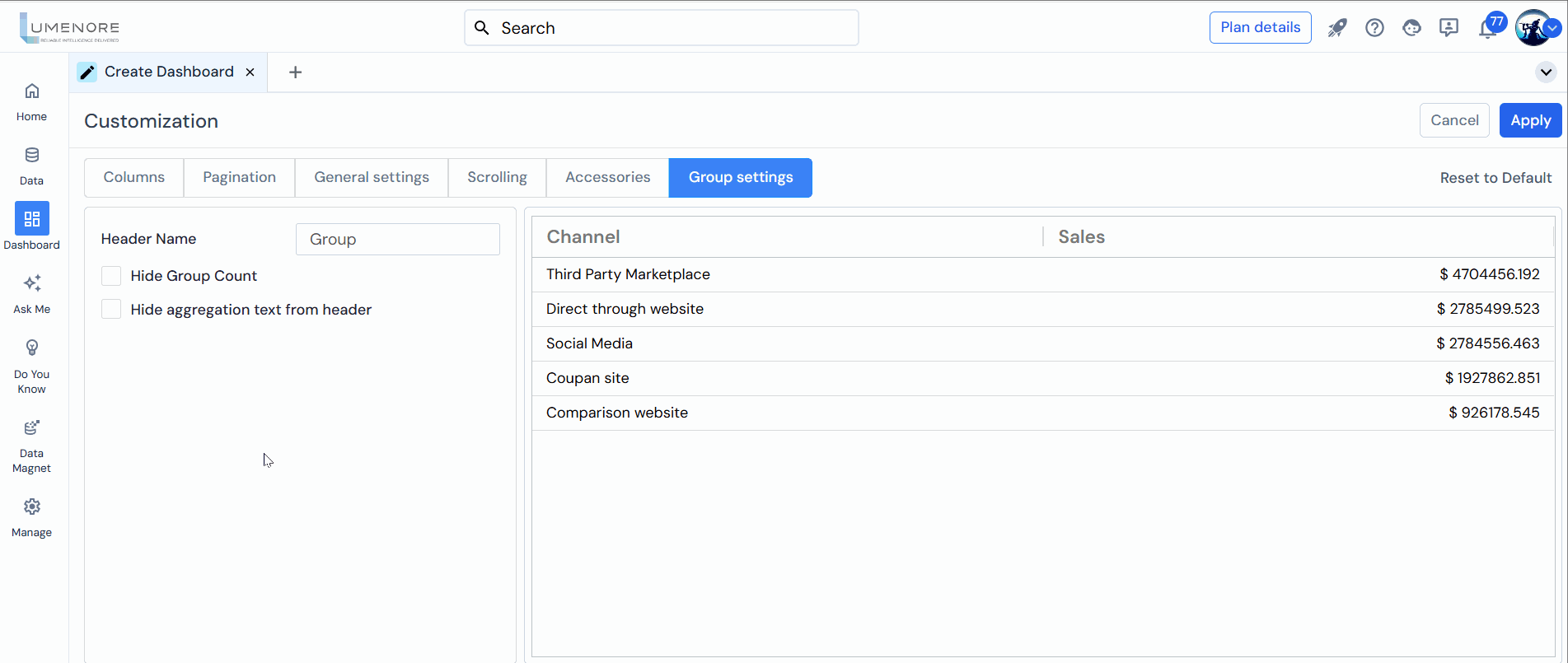
Group Setting
In Group Settings, the user can customize the group properties in the chart.
Users can customize the following options:
- Header Name: In the Display Sidebar section, when the user creates a group (row group), they can name that group according to their specific needs. This allows users to provide a meaningful and descriptive name to the grouped rows, making identifying and understanding the data within that group easier.
- Hide Group Count: Enabling this option will hide the group counts in the grouping rows. Normally, when rows are grouped, a count of the number of items in each group is displayed. Users can remove the group count from the display by checking this option, resulting in a cleaner and more concise view of the grouped data.
- Hide Aggregation Text from Header: This option allows users to hide the aggregation text from the column header. Aggregation text refers to the summary or calculation applied to a particular column, such as SUM, COUNT, or other functions. By enabling this option, the aggregation text will not be displayed in the column header, resulting in a more streamlined and visually clean representation of the data.